Submitted about 1 year agoA solution to the Meet landing page challenge
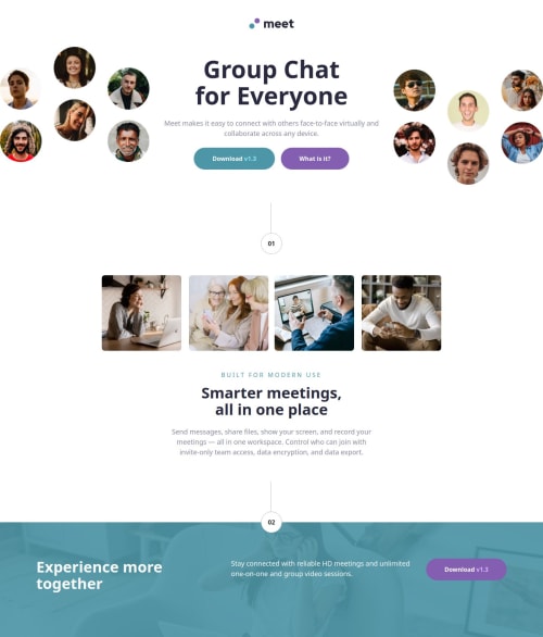
Meet landing page using Bootstrap 5.3
bem, bootstrap, sass/scss
@tomwinskell

Solution retrospective
What are you most proud of, and what would you do differently next time?
- Took longer than expected because I was learning Bootstrap.
- Working mostly in the html file saves switching back and forth between html and css. Will be quicker once I know all of the class names and specifics of Bootstrap.
- Layout was challenging because of the different layouts for each screen size.
- CSS Grid can be used to overlay items. Blog post here: http://tomwinskell.simple.ink/.
Code
Loading...
Please log in to post a comment
Log in with GitHubCommunity feedback
No feedback yet. Be the first to give feedback on Tom Winskell's solution.
Join our Discord community
Join thousands of Frontend Mentor community members taking the challenges, sharing resources, helping each other, and chatting about all things front-end!
Join our Discord