

Design comparison
SolutionDesign

Solution retrospective
What are you most proud of, and what would you do differently next time?
-
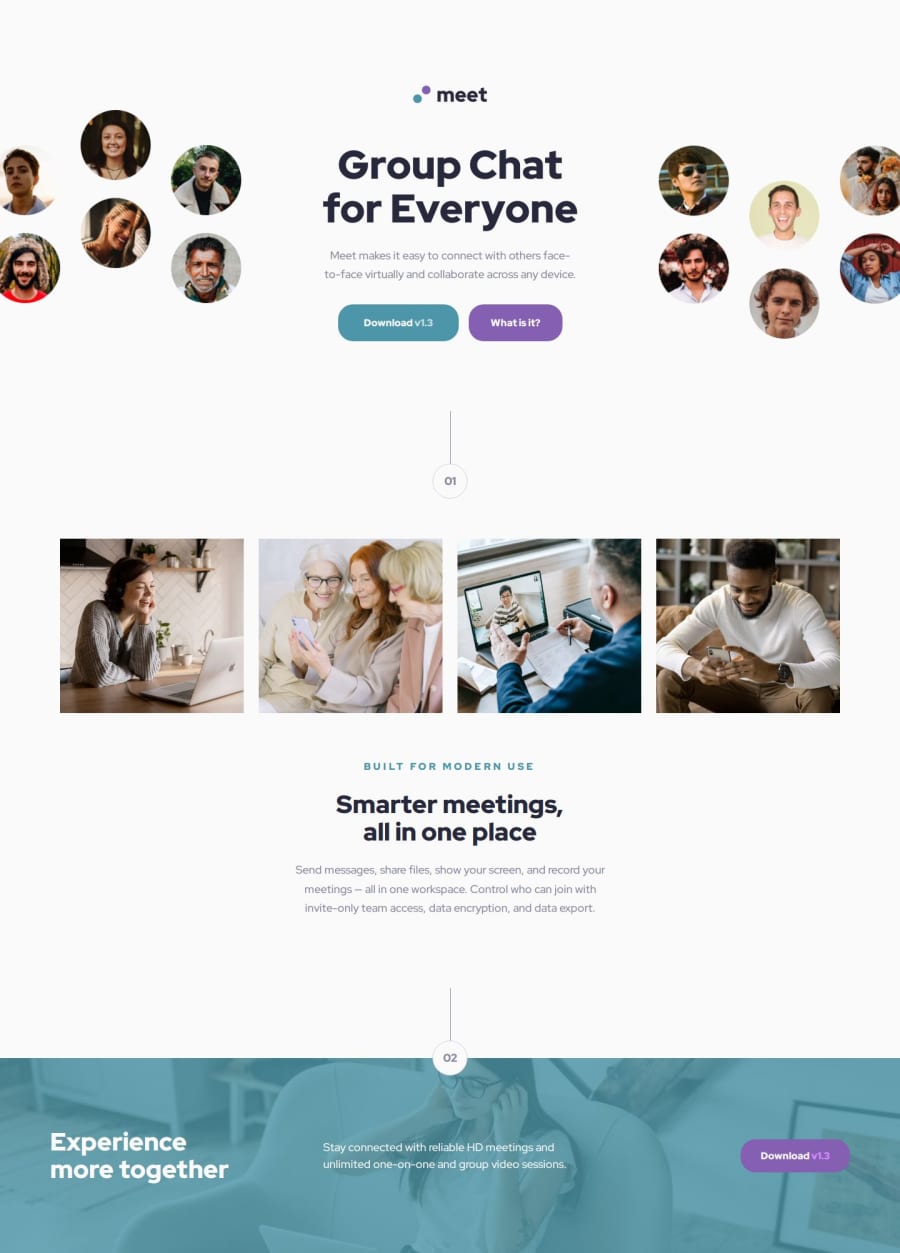
Responsive Design
- Mobile-first approach
- Breakpoint system using em units:
- sm: 36em (576px)
- md: 48em (768px)
- lg: 62em (992px)
- xl: 75em (1200px)
-
Typography
- Fluid typography implementation using clamp()
- Consistent type scale across breakpoints
- Accessible text contrast ratios
-
Spacing System
- 8pt grid system using rem units
- Consistent spacing patterns:
- spacing-800 for mobile/tablet layouts
- spacing-1400 vertical and spacing-1000 horizontal for desktop layouts
-
CSS Architecture
- Modular SCSS structure
- Custom properties for theming
- Reusable components and utility classes

Join our Discord community
Join thousands of Frontend Mentor community members taking the challenges, sharing resources, helping each other, and chatting about all things front-end!
Join our Discord