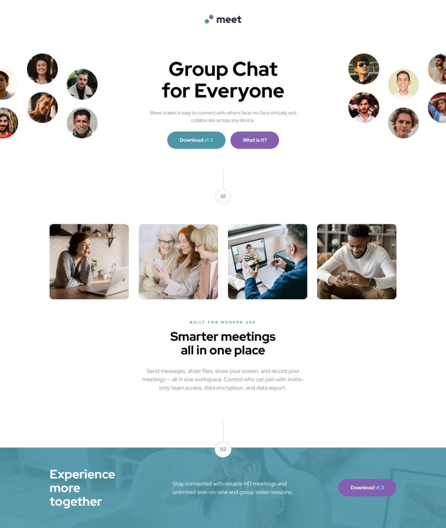


Design comparison

Solution retrospective
I'm glad to have continued working with Sass and BEM (and am enjoying it!), and feel I'm getting more comfortable and familiar with how to implement them together. I feel as though I'm getting much faster and more familiar with layouts in general and working with flexbox and elements such as `````` for good responsive design.
Next time I would consider using grid more instead of flex everywhere, it is probably my default preference. I would also spend a little more time planning out the layout and solution before beginning coding as I ended up changing the Sass structure a few times.
What challenges did you encounter, and how did you overcome them?It took me some time to get the image correct for the footer! I was playing around with it for a long time because of my lack of understanding of the position property, and the stacking context, things I'm probably still not fully understanding. I found a helpful digital ocean tutorial (linked in the readme), and just kept trying different things until it was correct. Working with images is something I'm still getting better at.
I would love to ask for feedback on two things in particular:
- How I have used Sass and BEM in the project
- Whether the pictures in the solution should have been done in a different way. Particularly things like the mobile footer picture looks zoomed in compared to the design.
Thank you for looking at my solution!
Community feedback
- @JamesLavironPosted 7 months ago
- Does the solution include semantic HTML?
Yes it does, ice work here.
- Is it accessible, and what improvements could be made?
It's accessible. However you could add some aria-label to images and buttons in order to explicit what it is.
- Does the layout look good on a range of screen sizes?
Yes it does, however on mobile it seems like your image take more space than current screen width. Maybe add
overflow-x: hidden;to body in order to remove it.- Is the code well-structured, readable, and reusable?
It is well done! I would have put text presets inside classes using
@includeas many presets are linked to "common" elements such as h1/h2 tags or description class.Moreover you could use mixins in order to use it for responsive handling such as (if you code mobile-first):
@include desktop { [desktop styles related to class/tag] } That way, if you ever change a device breakpoint, you don't have to change it 25 times xD- Does the solution differ considerably from the design?
It's very close to design. Good job mate :)
Marked as helpful1P@i-prkrPosted 7 months ago@JamesLaviron Thank you so much for your comment, I have found it very helpful! Great tip particularly regarding the text presets as mixins, I will try to use that in the future :)
Appreciate your time, happy coding!
1

Please log in to post a comment
Log in with GitHub
Join our Discord community
Join thousands of Frontend Mentor community members taking the challenges, sharing resources, helping each other, and chatting about all things front-end!
Join our Discord