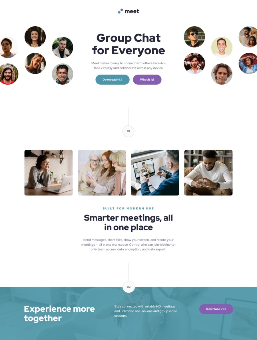
Meet landing page / responsive design for different devices


Design comparison

Solution retrospective
👉I tried to get a smooth transition between the different output sizes. With trial and error I came to the conclusion that if you give an element a max-width and centre it with margin-left and margin-right ‘auto’, you could already achieve a lot. In addition, clamp()-function helped me not only with font-sizes, but also with the scaling of images and spacing.
🔎 In the future, I would also like to learn more about tricks and tips for smooth transitions between different output devices to achieve a responsive design.
What challenges did you encounter, and how did you overcome them?👉 First time that I used the 'background-image' with the linear-gradient and also first time I created a section devider like this.
- background-image - This helped me for designing the footer-background.
👉 I liked using the picture-element in this way for the desktop media-query without css. Using the picture-element and the srcset attribute also ensures that only the necessary images are loaded depending on the screen size.
What specific areas of your project would you like help with?I have spent some time thinking about how to structure the html and also how to use BEM correctly. There is certainly room for improvement. I am looking forward to your suggestions.
It would be interesting to know whether all images (with the exception of the logo) should be considered decorative. In this case I did it, and provided a null (empty) alt text (alt="") so that they can be ignored by assistive technologies. What do you think?
Community feedback
Please log in to post a comment
Log in with GitHub
Join our Discord community
Join thousands of Frontend Mentor community members taking the challenges, sharing resources, helping each other, and chatting about all things front-end!
Join our Discord