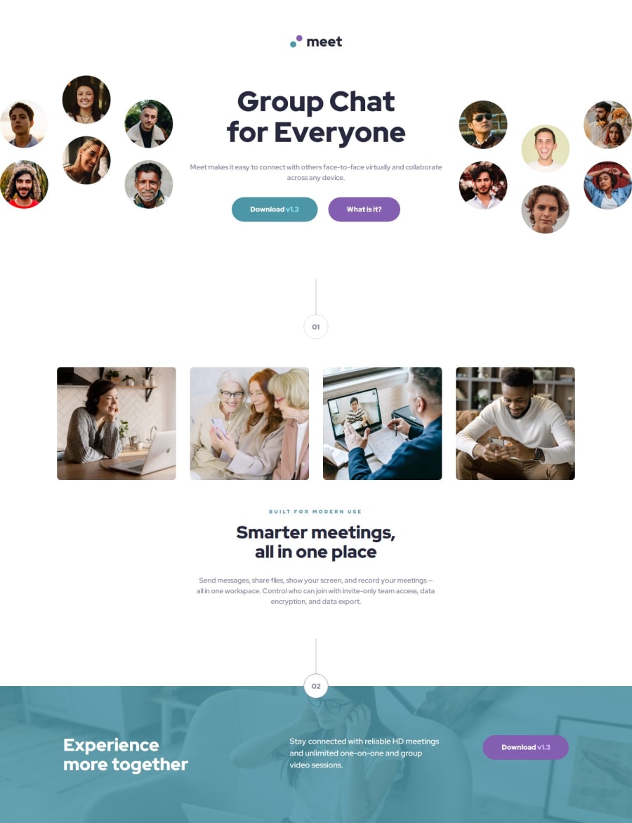
Design comparison
Solution retrospective
I started using Responsively locally to test on multiple devices and noticed problems with CSS nesting support, so I decided to remove it.
Next time I will not use it. I think pre-processors are best for CSS management.
What challenges did you encounter, and how did you overcome them?The most challenging part was the footer, with the background image blended with a background color. I spent most of the day on that part alone when I noticed the image actually appeared behind half of the circle.
I ended up reworking the implementation and then using a separate element to create the overlay.
I also found very challenging maintaining fidelity to the design in between the breakpoints but I think the result is very good.
What specific areas of your project would you like help with?I would like help in two areas:
-
The hero image/s without using the translate function. I still did NOT find a way to replicate the design responsively. I managed to offset it a bit with
position: relative
and a negativevalue
but it's not as fluid as I wanted. -
The image background in the footer blended with some color: I used an overlay with a fill color, but can we also use gradients?
-
The contrast ratio of the colors provided in the design it often does NOT pass WCAG 2 AA requirements. I have a problem with this and I think that maybe I am not understanding how to read the design documents.
Thank you for any help.
Community feedback
- @ownedbyanonymousPosted about 2 months ago
Hey Emanuele Fabrizio 👋🏾
Well done on completing the challenge and coming as close as possible to the Figma designs🔥🔥🔥. I salute your effort and l am impressed by you work because l also worked on the same challenge and it was particularly not the easiest challenge, there were tricky parts especially when it came to images.
Here are a few pointers and hope you find them useful
-
For accessibility purposes, l think it's best to use semantic tags as compared to non-semantic tags as they provide meaning to elements. For users that use screen reader it means each section is clearly defined which provide better understanding and context to them. For example instead of using the div element for the hero section, image-collage and text-content sections we could use of the section element.
-
With regards to the hero images, l did use Flexbox and displayed the Flexbox items in a row and used justify-content: space-between to space the items. Here are some code snippets
<section class="hero flex-container"> <img src="./assets/desktop/faces-left.svg" alt="Meet Landing Page" class="image-left" /> <div class="hero-content flex-container"> <h1 class="text-preset-2">Group Chat for Everyone</h1> <p class="text-preset-5"> Meet makes it easy to connect with others face-to-face virtually and collaborate across any device. </p> <div class="cta-buttons flex-container"> <a href="#" class="button blue">Download v1.3</a> <a href="#" class="button purple">What is it?</a> </div> </div> <img src="./assets/desktop/faces-right.svg" alt="Meet Landing Page" class="image-right" /> </section>
.hero{ width: 100vw; display: flex; justify-content: space-between; flex-direction: row; } .hero > img{ width: 24.63rem; height: 18.88rem; } /*Then for tablets and mobile devices l implemented the following*/ .hero-content::before{ content: url("../assets/mobile/combined-image.svg"); width: 100vw; height: auto; } .image-left, .image-right { display: none; }
Hope you find the feedback useful. You are the more than to reach out if have questions or would want us to go through the challenge together.
Marked as helpful1 -
Please log in to post a comment
Log in with GitHubJoin our Discord community
Join thousands of Frontend Mentor community members taking the challenges, sharing resources, helping each other, and chatting about all things front-end!
Join our Discord