

Design comparison

Solution retrospective
I tried playing around with different ways of nesting styles under @mixins and @includes. I learned a bit about how I can use these to my advantage to keep my main styles cleaner and a little more modular. They could certainly still use some work.
Next time I'd like to explicitly plan out my grids a little better. I spent a lot of time redoing work that I sloppily threw together earlier on.
What challenges did you encounter, and how did you overcome them?I am still a little fuzzy on using the <picture> element. I ended up having to abandon it anyway with my implementation of the hero images. I couldn't find a way to split one image into two images using backup srcset and screen widths (if such a thing is possible without explicit css).
All criticism welcome - thanks!
Community feedback
- P@CarlHummPosted 28 days ago
Hi Gabe, well done on your solution!
Here are a couple of areas that could be improved
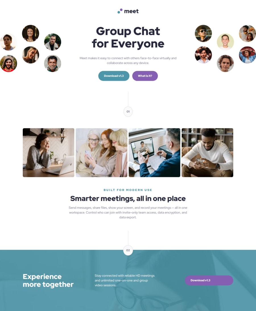
1. Group content and ensure it's centered within the correct columns
When I expand the page I noticed some elements are not aligned correctly in the call to action section, namely the heading appears at the bottom left, paragraph center and buttons bottom right. This is because unlike the avatar images they haven't been explicitly placed and are following a normal grid placement for each element.
One way you could solve this is to group these elements under a single container and then place them in the center. Given your current design this could look like the following.
    <div class="call-to-action__text">
    <h1>Group Chat for Everyone</h1>
      <p>Meet makes it easy to connect with others face-to-face virtually and collaborate across any device.</p>
      <div class="call-to-action__text-links">
        <a class="call-to-action__download button" href="#">Download v1.3</a>
        <a class="call-to-action__info button" href="#">What is it?</a>
      </div>
    </div>
By default this element should sit in the center, but if it doesn't you can use the same method to style it.
.call-to-action__text {
grid-column: 2 / 3;
}
2. Close Alt Attribute on Right Image
<img class="call-to-action__image-desktop call-to-action__image-desktop--right" src="./assets/desktop/image-hero-right.png" alt="A collage of portraits featuring smiling Meet users>Aside from this I noticed on your right side image you have forgotten to close your quotes for the alt attribute.
Conclusion
Hope this advice helped, not entirely sure in regards to the picture element but I believe it cant handle multiple images in that way.
Edit: I just noticed you had an identical element named call-to-action__text, I guess the alt attribute messed up the markup :)
Marked as helpful0

Please log in to post a comment
Log in with GitHubJoin our Discord community
Join thousands of Frontend Mentor community members taking the challenges, sharing resources, helping each other, and chatting about all things front-end!
Join our Discord