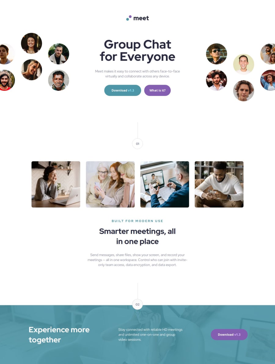
Design comparison
Solution retrospective
I am proud to have finally finished this project.
Next time, I would just approach the project in a more simplified manner and try not to overthink every single step...go with what you know!!!
What challenges did you encounter, and how did you overcome them?Many!
I was trying to incorporate both grid and flexbox, but in a totally overkill way.
Next time just prepare the html and apply either grid of flexbox where appropriate and do not try to just make it work!
Use the tool that best suits in solving the solution.
I overcame the issues but stepping back and looking at the solution again.
What specific areas of your project would you like help with?My css is in shambles with this one...
I will be working hard on this for the next project to make sure that it is more legible and to try and not repeat myself so much in order to 'just make it work'.
Please log in to post a comment
Log in with GitHubCommunity feedback
- P@srijanss
Congrats on completing the challenge
- It looks good on all the desktop, tablet and mobile size.
- However, if we choose device size between mobile and tablet, desktop and tablet then there is issue with responsiveness. Mostly images in hero section has issues in those screen sizes.
- I can see that you have used position: relative and left: px Css properties to match with the provided design. I also used the same properties to lay out the contents on my first try. But it was too much tweaking of pixels to match the design. So, I used object-fit and object-position CSS properties for image. You can follow this link https://web.dev/learn/design/responsive-images to get all the info about responsive images.
- You have used <section>, <header> element to make the html semantically correct. But use of <header> element at multiple places can created accessibility concern. You can use <section> for the content which have header, content and have standalone meaning. You can follow this link https://web.dev/learn/html/headings-and-sections to get info about headings and sections.
You have done a great job.
Join our Discord community
Join thousands of Frontend Mentor community members taking the challenges, sharing resources, helping each other, and chatting about all things front-end!
Join our Discord
