Design comparison
Solution retrospective
Overall, happy I'm getting the hang of the BEM naming conventions. I also pulled my CSS reset into a separate file this time, which I probably should have done on previous projects as well.
I'm not thrilled with how I've organised containers for styling purposes in this project. Things look sort of okay, but I think working mobile-first screwed me a bit when I got to the desktop design. I think I'm going to stop plowing through the learning paths and try out some more level 1 and 2 designs before moving forward.
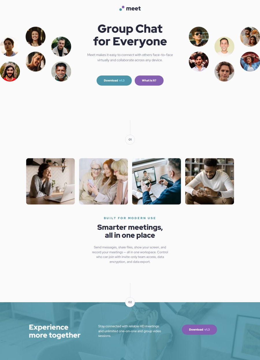
What challenges did you encounter, and how did you overcome them?I was at a bit of a loss as to how to apply a blue overlay to the footer image, but ended up using the background-gradient property, which stopped me from needing to mess with a div laid over the top to achieve the effect needed.
Please log in to post a comment
Log in with GitHubCommunity feedback
No feedback yet. Be the first to give feedback on Theo Harris's solution.
Join our Discord community
Join thousands of Frontend Mentor community members taking the challenges, sharing resources, helping each other, and chatting about all things front-end!
Join our Discord
