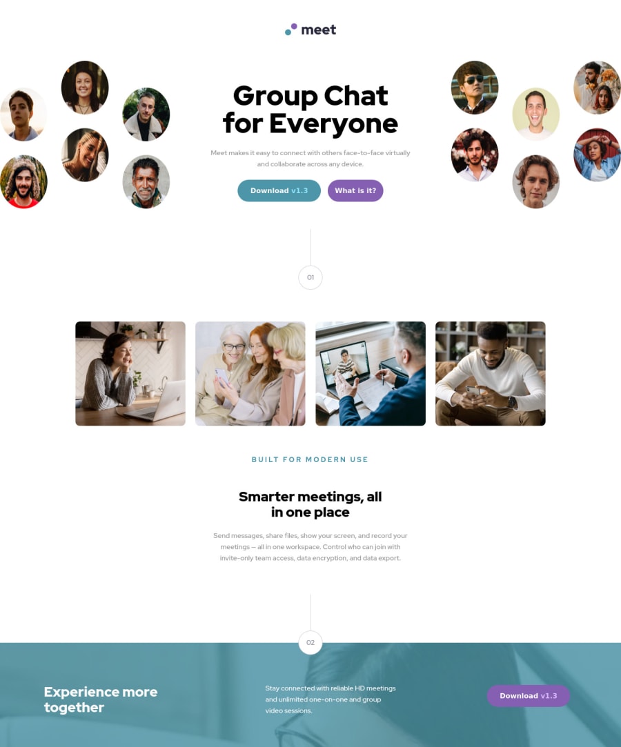
Design comparison
Solution retrospective
Biggest Challenge: Responsiveness from small screen to big screen.
- I built the website using the phone design first
- but the Desktop version requires that an element (firstpart) movers in between the two images (bubbleImg).
- That requires JQuery, which I successfully did (but it still looks weird and redundant)
- However when deployed on netlify the jquery code doesn't seem to be executed at all... What to do ? !
Community feedback
- @ChamuMutezvaPosted over 2 years ago
Greetings Mariem.
You have done a good job, well done. Here are a few things to look at.
- You do not need Jquery for this project. On my machine , it is not loading, check if you are not getting the following error in the console,
Blocked loading mixed active content “http://ajax.googleapis.com/ajax/libs/jquery/1.7.1/jquery.min.js”
. The reason behind is because your project is loading usinghttps
in the deployed sitehttps://fantastic-dragon-4ad89c.netlify.app/
, where as the jquery is loading usinghttp
. Browsers for security reasons have a tendency to block that. - now since jquery is not loading a second error is recorded
Uncaught ReferenceError: $ is not defined
. In short then, whatever jquery is supposed to do , is not happening(on my machine). - there are recommended methods that should be used when working with images, cases where you have a special image for small devices, another for medium devices and maybe another for large devices. The correct terms associated with these methods are
resolution switching
andart direction
. Notably two of the most used methods aresrcset
and thepicture element
, here is a link to the one i normally use, which is picture element. I believe this is the area where you intended to use Jquery. - The site looks good
Marked as helpful0@MabchirPosted over 2 years ago@ChamuMutezva This was extremely helpful ! The bug was easily fixed with https trick. thank you for sharing the picture element resources I will check it out and apply it ! Thank you for your time
0 - You do not need Jquery for this project. On my machine , it is not loading, check if you are not getting the following error in the console,
- @shashreesamuelPosted over 2 years ago
Hey, good job completing this challenge
Keep up the good work
Your solution looks great however I think that the following should be considered
-
The image below the website logo should be left aligned as seen in the design.
-
The first button below the website description needs less padding left and padding right and the second button should not wrap.
-
The text "Smaller meetings all in one place" is supposed to be a bit bigger and wrap after the word "all".
-
The description below the text mentioned above needs to be a little bit bigger and wrap after the word "your".
-
The heading text in the footer section needs to be a little bit bigger
-
The footer description needs a bit less line-height using
line-height
-
The "Download v1.3" button needs some margin from the right using
margin-right
and it needs to have less padding on both the left and right side of the text.
Lets talk about your code 😊
-
Excellent usage of css variables
-
Excellent usage of the
min-width
property
In terms of your validation errors, your script tag which references jquery needs the
type=module
attribute.I hope this helps
Cheers Happy coding 👍
Marked as helpful0@MabchirPosted over 2 years ago@TheCoderGuru Thank you so much for your time, positive and constructive feedback !!! this was very helpful
0 -
Please log in to post a comment
Log in with GitHubJoin our Discord community
Join thousands of Frontend Mentor community members taking the challenges, sharing resources, helping each other, and chatting about all things front-end!
Join our Discord