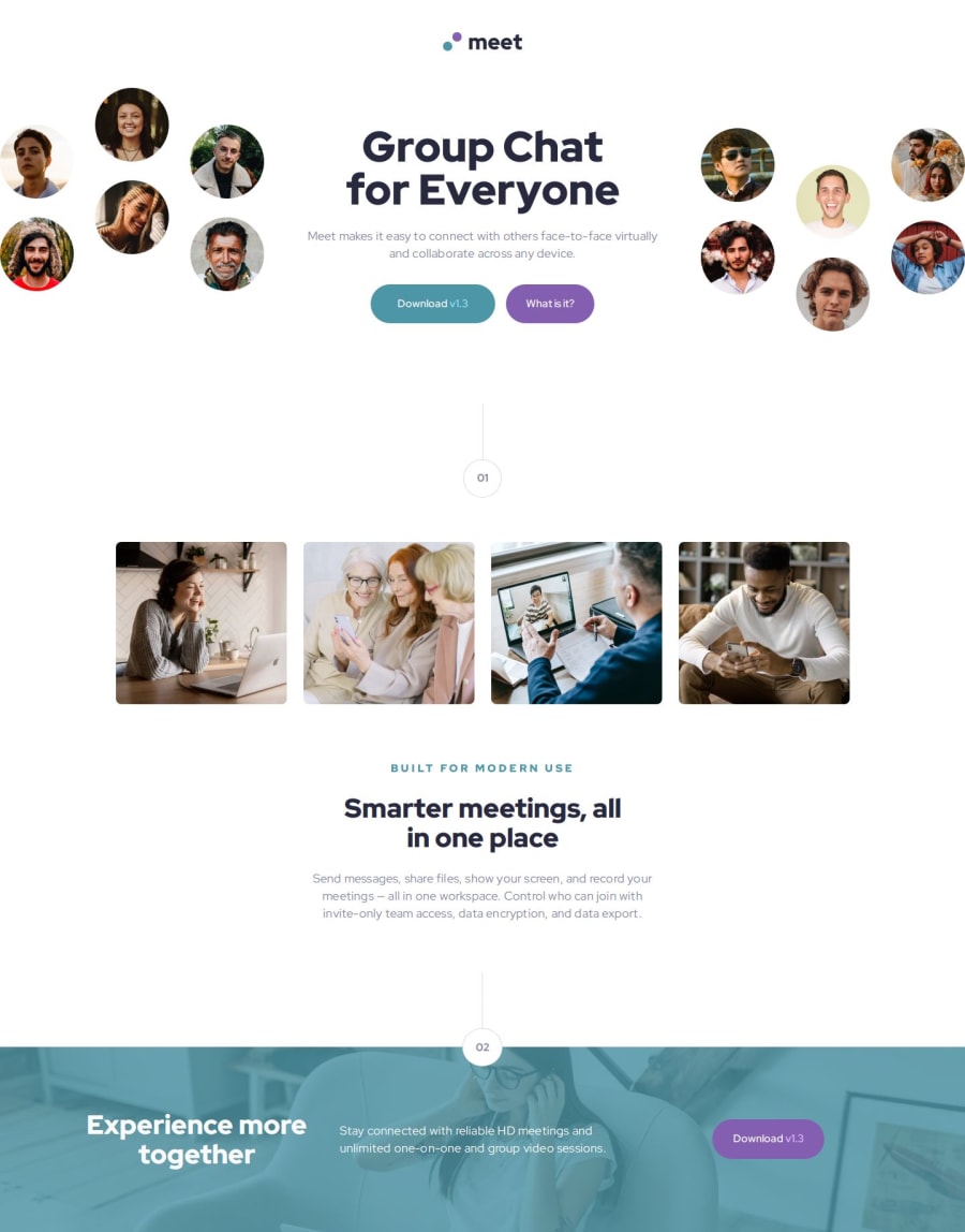
Design comparison
Solution retrospective
managed to do it, better thought out css classes
What challenges did you encounter, and how did you overcome them?the margin paddings, but I almost managed to do it
What specific areas of your project would you like help with?e.g. I gave fixed widths for the images, probably not the best solution. I actually just tried the gulp, postcss, autoprefixer packages and breaking them into sass files.
Community feedback
- @psdesignroPosted 9 months ago
Hi, looks pretty good!
You can try to set some negative margins to the hero images + overflow:hidden, to have the "cut" effect from the original design.
Also for the footer, the H2 should be left aligned for desktop.
However, your code is written cleaner than mine :)
Marked as helpful1
Please log in to post a comment
Log in with GitHubJoin our Discord community
Join thousands of Frontend Mentor community members taking the challenges, sharing resources, helping each other, and chatting about all things front-end!
Join our Discord
