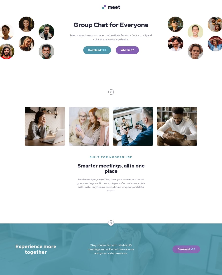
Design comparison
SolutionDesign
Solution retrospective
What did you find difficult while building the project? I had some trouble placing the images in the header.
Which areas of your code are you unsure of? Maybe just the image positioning in the header, or the two vertical lines. I used svgs but not sure if that was best.
Do you have any questions about best practices? I'm always looking to hear about better ways to do CSS, so if you see something, let me know.
Please log in to post a comment
Log in with GitHubCommunity feedback
No feedback yet. Be the first to give feedback on Ryan Stehle's solution.
Join our Discord community
Join thousands of Frontend Mentor community members taking the challenges, sharing resources, helping each other, and chatting about all things front-end!
Join our Discord
