Meet Landing Page

Solution retrospective
Built with. 🔨
- HTML & CSS.
- Vite.
Features. ✨
- Converted the JPG images in the middle of the page to WebP format for better performance.
- Self-hosted fonts for faster loading.
Ending Notes 📝
- Nothing completely new was learned but this project gave me some good experience considering this had a fair amount of elements. Up until now most of the projects i have done were component projects or coming soon pages with a far less number of elements than this. So this was a good opportunity to apply and practice the things i have been learning so far.
-
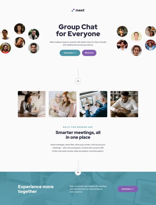
The hero image at the top was a bit tricky. On mobile layout it’s one image. But on the desktop layout it’s two separate images. To achieve that result i used two `` elements. Both picture elements have the mobile version of the image as the default image. Then, one picture element has the left desktop image as the
srcsetwhile the other picture element has the right desktop image as thesrcset. Since mobile image is the default for both picture elements, one picture element is hidden on mobile screen usingdisplay: none. Only one is visible. When the screen is on desktop sizing, both picture elements will be visible and both will be switched to the image defined in their respectivesrcsets. Giving the required result. -
On the design file there was an overflow effect on the hero image, i struggled a lot to achieve it, and with some help managed to get it to a working state. But in the end i ended up not using it. I liked the current solution without any overflowing effect on the image.
-
There were couple of places where the color contrast wasn't passing the check, but i didn't want to change the colors in the design. As a result, couldn't hit the 100% mark on the lighthouse accessibility test.
Would love some overall feedback on any areas where I can improve.
Please log in to post a comment
Log in with GitHubCommunity feedback
No feedback yet. Be the first to give feedback on Darkstar's solution.
Join our Discord community
Join thousands of Frontend Mentor community members taking the challenges, sharing resources, helping each other, and chatting about all things front-end!
Join our Discord