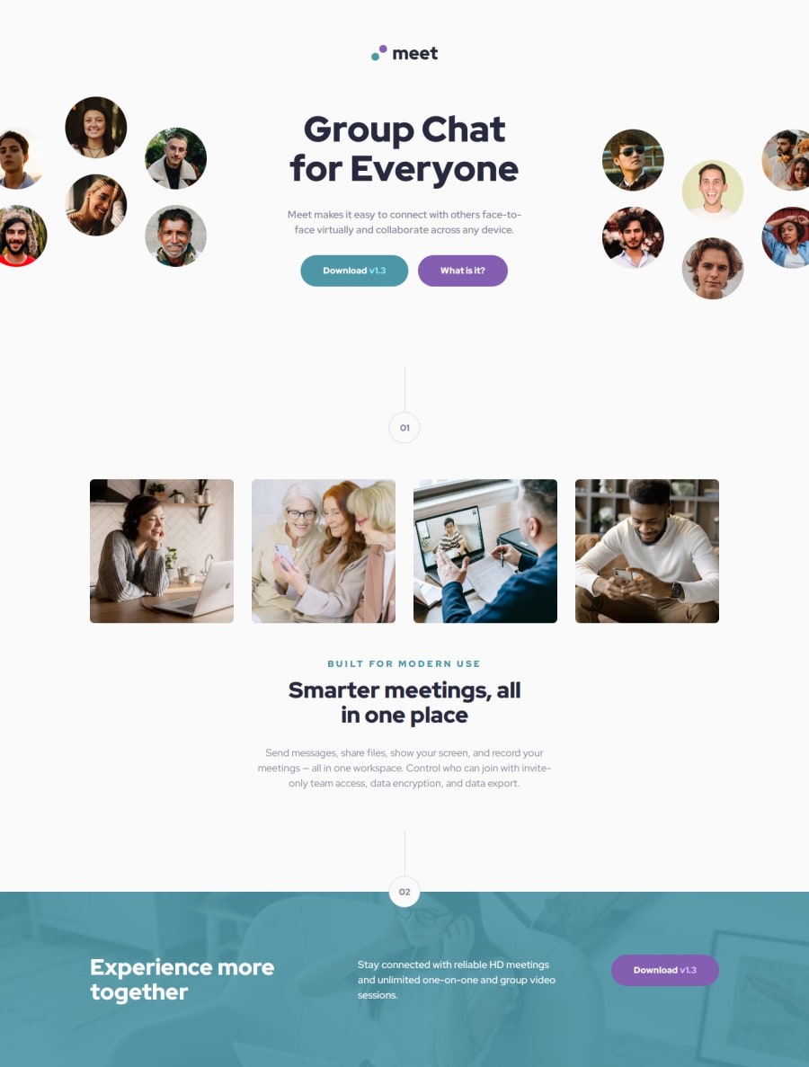


Design comparison

Solution retrospective
I’m most proud of building my first complete landing page. This project allowed me to apply a wide range of skills and techniques that I learned from Frontend Mentor’s materials. Next time, I’d definitely start using a design system or component library right from the beginning. It’d make it easier to keep things consistent and scalable throughout the project.
What challenges did you encounter, and how did you overcome them?One of the main challenges I faced was getting the layout to look good across different screen sizes. CSS Grid and Flexbox were super helpful, but I had to experiment a lot to get everything aligned just right. To overcome this, I used a mobile-first approach and tested frequently on various devices to make sure the design adapted well. Overall, it was a lot of trial and error, but with some patience and persistence, I managed to get everything working smoothly.
What specific areas of your project would you like help with?Building a design system elegantly 😄
Community feedback
- P@aouintihouariPosted 7 months ago
Great work, bravo
Semantic HTML: Your HTML structure is clean and uses appropriate semantic tags (header, main, section, footer), which is great for accessibility and SEO. Responsive Design: You've implemented responsive styles effectively, with media queries for different screen sizes (mobile-first approach). The use of Flexbox and Grid layouts provides good flexibility across devices. Clear Class Naming: The class names are descriptive, following a BEM-like convention (e.g., .hero__btn-blue, .footer-cta__btn). This makes your CSS modular and easier to maintain. CSS Reset: Including a CSS reset at the beginning helps ensure consistent styling across browsers. Use of Variables: Great use of CSS custom properties (--cyan-600, --slate-900, etc.), making your color scheme reusable and easy to update globally.
Best Practices to Implement: DRY Principle: You have repetitive padding and font size definitions across multiple sections (e.g., .hero__btn-blue, .footer-cta__btn). Consider using utility classes or grouping shared properties to follow the "Don't Repeat Yourself" principle. Fallback Fonts: While using a custom font (Red Hat Display), it’s a good practice to define a fallback font-stack (e.g., font-family: "Red Hat Display", Arial, sans-serif;) to ensure content remains legible if the font fails to load. CSS Structure: Break down your CSS into smaller, modular files if your project grows (e.g., separate files for typography, buttons, layouts). This improves maintainability and scalability. More Specific Media Queries: Adding more breakpoints for medium-sized devices (between tablet and desktop) could help ensure that the design looks better across a wider range of devices.
Marked as helpful1

Please log in to post a comment
Log in with GitHub
Join our Discord community
Join thousands of Frontend Mentor community members taking the challenges, sharing resources, helping each other, and chatting about all things front-end!
Join our Discord