Design comparison
Solution retrospective
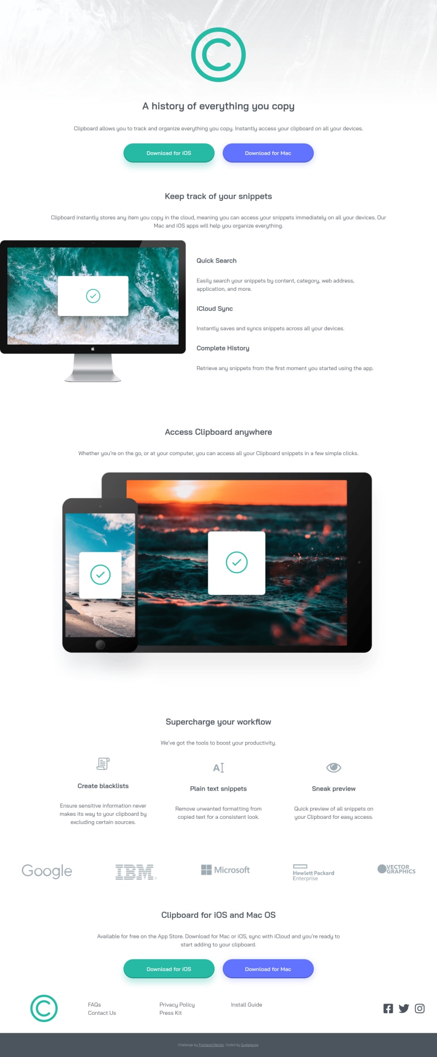
This is a rough draft that I'm submitting just to unlock access to everyone else's solution. It was made while caring for a sick 4yo, so it's very messy and rough and also looks awful on ~800px screens. But I'm just too tired to keep polishing it now. The most obvious weak points are the lame breakpoints in media queries and generally messy CSS structure. I didn't bother much about font sizes so they're off as well. But if there's anything else that's equally terrible and needs urgent attention, please point it out :)
Community feedback
Please log in to post a comment
Log in with GitHubJoin our Discord community
Join thousands of Frontend Mentor community members taking the challenges, sharing resources, helping each other, and chatting about all things front-end!
Join our Discord
