Submitted 4 months ago
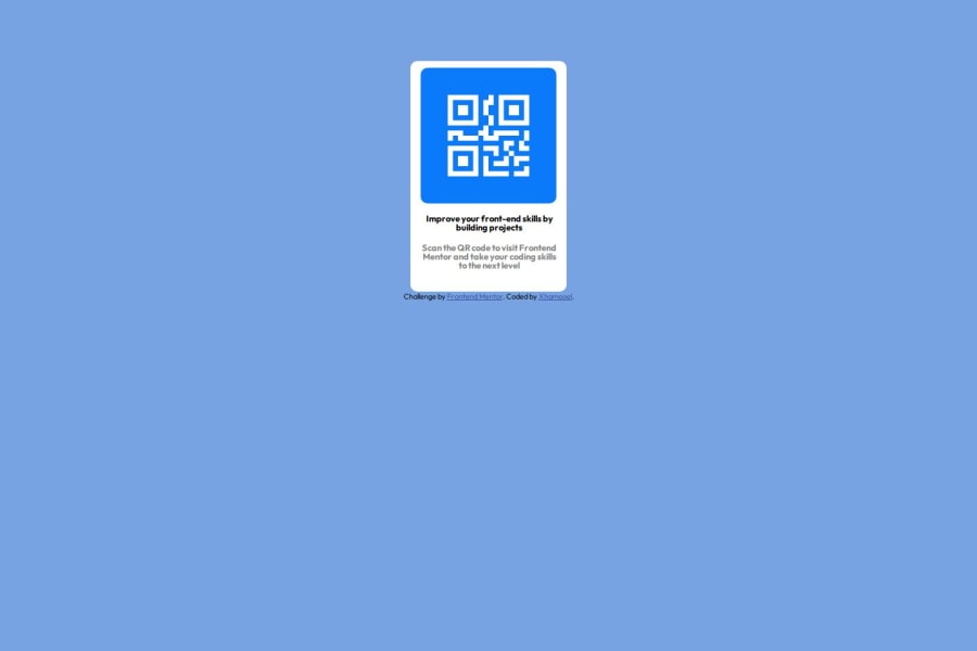
@media screen to for big screen and small screen, position relative
@cyberrspace
Design comparison
SolutionDesign
Solution retrospective
What are you most proud of, and what would you do differently next time?
I am proud of the fact that I was able to fix almost all the challenges myself. When next I am writing code I will always work on writing a neater code. I will learn more about text arrangement.
What challenges did you encounter, and how did you overcome them?The only challenge I encountered was getting an adjustable QR code icon which I later got the svg icon from boostrap icons. css was able to adjust the color, width, height and the position of the icon
Community feedback
Please log in to post a comment
Log in with GitHubJoin our Discord community
Join thousands of Frontend Mentor community members taking the challenges, sharing resources, helping each other, and chatting about all things front-end!
Join our Discord
