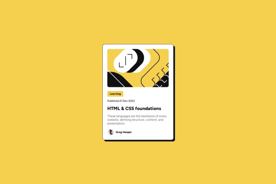
Design comparison
SolutionDesign
Community feedback
- @ilyesfennourPosted 3 months ago
Hi, congrats on completing the project.
I have reviewed your code and have a few suggestions to help you improve it:
Landmark: You forgot to add a landmark. You can either add
role="main"to the parent of your card or use the<main>element, which is already recognized as the main content landmark.Min-Height on Body: Instead of using height for the body, use min-height. This allows the body to expand with the content and provides a better experience as content grows.
I hope these tips help enhance your project. Feel free to reach out if you have any questions or need more details!
0
Please log in to post a comment
Log in with GitHubJoin our Discord community
Join thousands of Frontend Mentor community members taking the challenges, sharing resources, helping each other, and chatting about all things front-end!
Join our Discord
