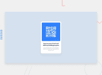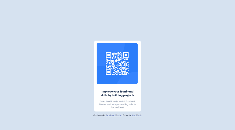
Media query for responsive design and flexbox layout for centering div
Design comparison
Solution retrospective
What are some best practices for writing class names?
Community feedback
- @FluffyKasPosted over 2 years ago
Hiyo,
There are some naming conventions for classes - BEM being one of the popular ones. I remember I found it difficult too to come up with good names when i started out but it comes with practice! ^^ Eventually you will either follow a naming convention like BEM or work out your own unique style that you - and hopefully others - find easy enough to follow.
I'd say you did a fine enough job here on naming - and on everything else really, so well done! I have some feedback though that you'll hopefully find helpful:
-
Naming the <body> element isn't necessary at all, as there's only one of it in each html document. You can target it directly with an element selector.
-
Your container div could be swapped for <main> which would give your solution a landmark (it's good to have it for assistive technologies and SEO reasons). This doesn't need to be given a class usually, can also be targeted by an element selector.
-
Your image needs to have an alt text. This is for people who don't see images / have images turned off, it provides a text alternative for them. In case of decorative images, you can leave it empty. In this case, the image is quite important so perhaps something like "QR code for Frontend Mentor." would be a nice alt to add!
-
You named one of the paragraphs "heading" which seems funny, as there are heading elements in html you could choose for this >.< <h1> would be the most appropriate here, as this is the only heading present in your code.
-
You could better center your component if instead of using margin-top, you'd add this to the container:
align-items: center,min-height: 100vh. This will take care of the vertical centering nicely.
All in all, you should be proud, you did a great job here for your first challenge! Happy coding! ^^
Marked as helpful1 -
- @SamadeenPosted over 2 years ago
Hey!! Cheers 🥂 on completing this challenge.. .
Here are my suggestions..
- You should use <main class="container"> instead of <div class="container">.
- You can wrap your attribution section in a footer tag to avoid accessibility issues.
- You should add a
alttext to yourimgtag to aid screen-readers
This should fix most of your accessibility issues
. Regardless you did amazing... hope you find this useful... Happy coding!!!
Marked as helpful1
Please log in to post a comment
Log in with GitHubJoin our Discord community
Join thousands of Frontend Mentor community members taking the challenges, sharing resources, helping each other, and chatting about all things front-end!
Join our Discord

