

Design comparison
SolutionDesign

Community feedback
- P@lia-oliveiraPosted 5 months ago
Your solution was simple and visually perfect. You structured it in a very generic and reusable way. It’s hard to suggest improvements when I already find it really good, but I’ll try.
- I think it would make sense to replace the divs for the cards with sections since they are pieces of content that make sense on their own.
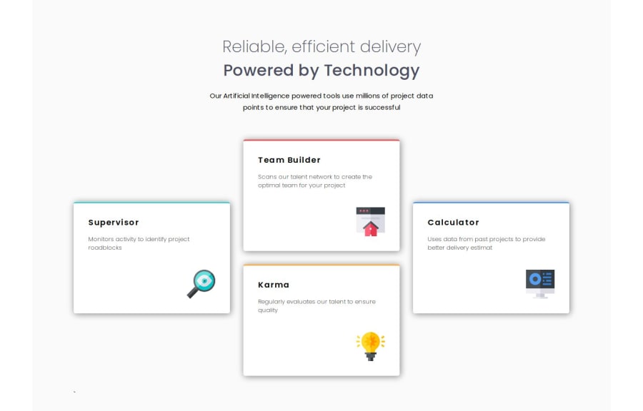
- The icons in this project are purely decorative. They don’t add meaningful information to the card, so I think it would be appropriate to include them via CSS. When reading the card, including the alt text, it feels a bit odd. For example: "Karma: Regularly evaluates our talent to ensure quality logo, a light bulb."
I hope this reflection is helpful. Thank you!
0

Please log in to post a comment
Log in with GitHubJoin our Discord community
Join thousands of Frontend Mentor community members taking the challenges, sharing resources, helping each other, and chatting about all things front-end!
Join our Discord