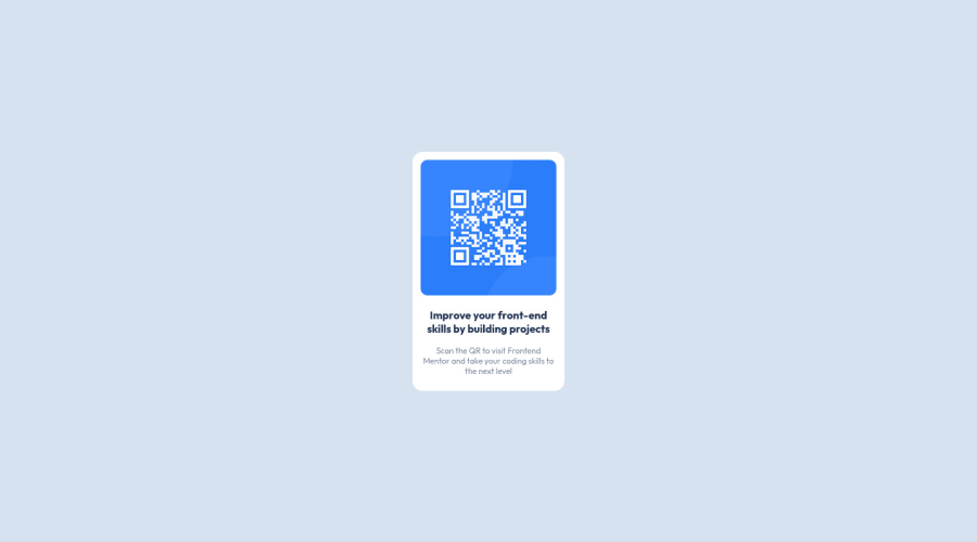
Design comparison
SolutionDesign
Community feedback
- @0xabdulkhaliqPosted over 1 year ago
Hello there 👋. Congratulations on successfully completing the challenge! 🎉
- I have other recommendations regarding your code that I believe will be of great interest to you.
HTML 🏷️:
- This solution lacks semantic markup, which causes lacking of landmark for a webpage and allows accessibility issues to screen readers, due to accessibility errors our website may not reach its intended audience, face legal consequences, and have poor search engine rankings, highlighting the importance of ensuring accessibility and avoiding errors.
- What is meant by landmark ?, They used to define major sections of your page instead of relying on generic elements like
<div>or<span>. They are use to provide a more precise detail of the structure of our webpage to the browser or screen readers
- For example:
- The
<main>element should include all content directly related to the page's main idea, so there should only be one per page - The
<footer>typically contains information about the author of the section, copyright data or links to related documents.
- The
- So fix it by replacing the
<div class="qr-main">element with the semantic element<main>in yourindex.htmlfile to improve accessibility and organization of your page.
CSS 🎨:
- Let me explain, How you can easily center the component for better layout without usage of
absolutepositioning.
- We don't need to use
absoluteto center the component both horizontally & vertically. Because using `absolute' will not dynamical centers our component at all states
- To properly center the component in the page, you should use
FlexboxorGridlayout. You can read more about centering in CSS here 📚.
- For this demonstration we use css
Gridto center the component
body { min-height: 100vh; display: grid; place-items: center; }- Now remove these styles, after removing you can able to see the changes
.qr-main {
  position: absolute;
  top: 50%;
  left: 50%;
  transform: translate(-50%,-50%);
}
- Now your component has been properly centered
.
I hope you find this helpful 😄 Above all, the solution you submitted is great !
Happy coding!
Marked as helpful0@semil338Posted over 1 year agoThank you so much for your feedback !!! @0xAbdulKhalid
0 - @shakhboz-shukhratPosted over 1 year ago
Hello there👋! Congratulations on completing this challenge!
There are no major issues with the code you provided. However, I have a few suggestions to make it more efficient and readable:
- Move the import statement for fonts to the top of the CSS file.
- Use shorthand properties for margin and padding.
- Use consistent units for font size and line height.
- Add comments to the code to make it easier to understand and maintain.
Here's the rewritten code with my suggestions:
/* Import Fonts */
@import url("https://fonts.googleapis.com/css2?family=Outfit:wght@400;700&display=swap");

/* Reset Styles */
* {
  margin: 0;
  padding: 0;
  box-sizing: border-box;
}

/* Main Styles */
body {
  font-family: "Outfit", sans-serif;
  background-color: hsl(212, 45%, 89%);
}

.qr-main {
  position: absolute;
  top: 50%;
  left: 50%;
  transform: translate(-50%, -50%);
  padding: 12px;
  border-radius: 15px;
  background-color: hsl(0, 0%, 100%);
}

.img-container img {
  width: 100%;
  height: 200px;
  object-fit: fill;
  border-radius: 10px;
}

.qr-heading {
  font-size: 1rem;
  font-weight: 700;
  color: hsl(218, 44%, 22%);
  text-align: center;
  margin: 16px 0;
}

.sub-heading-qr {
  font-size: 0.75rem;
  font-weight: 400;
  color: hsl(220, 15%, 55%);
  text-align: center;
  margin-bottom: 10px;
}

/* Media Query */
@media screen and (max-width: 375px) {
  .img-container img {
    width: 250px;
    height: 250px;
  }
}
Anyway, your solution is great. Hope you will find this helpful. Happy coding!
Marked as helpful0
Please log in to post a comment
Log in with GitHubJoin our Discord community
Join thousands of Frontend Mentor community members taking the challenges, sharing resources, helping each other, and chatting about all things front-end!
Join our Discord
