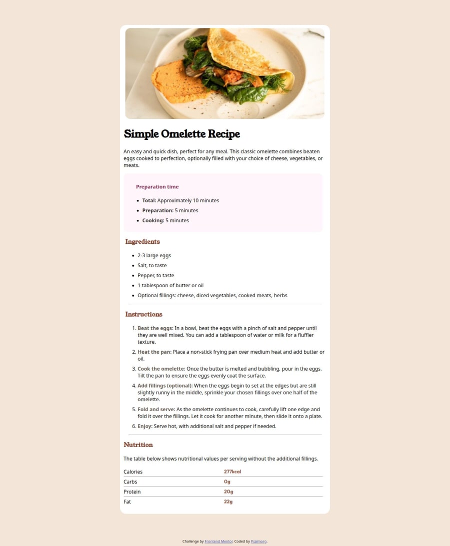
Design comparison
Community feedback
- @FlarienPosted 6 months ago
Nice work! It would be good if you adjusted a little margin and padding and perhaps the font-size to make it look better.
Marked as helpful0 - @Smith11bPosted 6 months ago
Great work!
With semantic html.
<header>tag is outside of the<main>tag as those are two different sections. They would both just need the same padding in order to get the white background on the card. The rest of the semantic html you used was great.It also looks like you missed putting padding or margin to the left of your list items (
<li>) tags.You can color the bullets and numbers by using the
::markerselector as well.Finally it looks like in your table, you forgot to add padding-left to the
td:first-child:of the<tr>tag. That would push it to the right a bit more so it lines up with the design.Overall great work though!
Marked as helpful0@PsalmorgPosted 6 months ago@Smith11b Thanks alot, I really appreciate this. Have try the ::marker but i can't use the table styling because i use grid. i will try to know know about CSS pseudo element. i don't much about them. I really appreciate your feedback.
0
Please log in to post a comment
Log in with GitHubJoin our Discord community
Join thousands of Frontend Mentor community members taking the challenges, sharing resources, helping each other, and chatting about all things front-end!
Join our Discord
