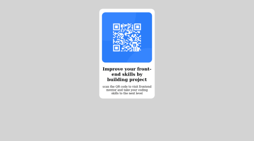
Design comparison
Solution retrospective
actually, I had little difficulty working with the @media but through the help of w3school I did it right.
Community feedback
- @dunaidanPosted almost 2 years ago
Hello, congratulations on your first project on Frontendmentor!
I see you didn't use the google font indicated in style-guide.md If you want to use google fonts you need to add a special style sheet link in the <head> section and then refer to the font in the CSS For this project you can find the font at Outfit Copy and add in the page head following code:
<link rel="preconnect" href="https://fonts.googleapis.com"> <link rel="preconnect" href="https://fonts.gstatic.com" crossorigin> <link href="https://fonts.googleapis.com/css2?family=Outfit:wght@400;700&display=swap" rel="stylesheet">
and then add in your css file:
body { font-family: "Sofia", sans-serif; }
Hope my comment will be helpful for you!
Marked as helpful1 - @atif-devPosted almost 2 years ago
Hi Tochukwu, congrats🎉 on completing the challenge. Better take care about following points.
- Always check Frontendmentor Report Generator issues after submitting the project for removing errors and warnings. To avoid accessibility issue "All page content should be contained by landmarks" use code as :
<body> <main> ---your code here---- </main> <footer> </footer> </body>
(why
main
matters? Read here)- For proper centering the container(whole card) vertically and horizontally you can use code as:
body { min-height: 100vh; display: grid; place-content: center; }
Or you can learn centering from here.
- If you have difficulty in responsiveness, you can learn from FreeCodeCamp or you can check out this free intro course for getting started in responsiveness.
- When we open GitHub repository link, at right side you will find an About Section. There, also include live preview link of your project. It is better for someone to check your live project while interacting with code.
If you liked the Feedback, Gladly upvote and click on MARKED AS HELPFUL 😇......Hope you will find this Feedback Helpful.🙂
Marked as helpful1 - @frank-itachiPosted almost 2 years ago
Hello there 👋. Congratulation for completing the challenge👍!
I have some suggestions about your code that might interest you.
HTML 📄:
- Wrap the page's whole main content in the
<main>
tag.
CSS 🎨:
- You can use grid or flexbox to center the content no matter the viewport size. Since I use grid to achieve such purpose, you can do the following:
body { min-height: 100vh; display: grid; align-items: center; justify-content: center; }
As I said, you can use flexbox to center the content and it will work as well.
body { min-height: 100vh; display: flex; align-items: center; justify-content: center; }
- Avoid using absolute length units px, especially for font-size and width properties, because they are not relative to anything else so that means they will always be the same size. Instead, you can use relative lengths like em or rem. The benefit of that last one is element which has that unit will scale relatively to everything else within the page, e.g., the parent container. You can dig up about it here.
I hope you find it useful! 😄 Above all, you did a good job!
Happy
<coding />
😎!Marked as helpful1 - Wrap the page's whole main content in the
Please log in to post a comment
Log in with GitHubJoin our Discord community
Join thousands of Frontend Mentor community members taking the challenges, sharing resources, helping each other, and chatting about all things front-end!
Join our Discord