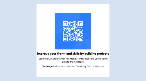
Design comparison
Solution retrospective
Handling media queries for making the design responsive
What specific areas of your project would you like help with?I would appreciate advice for improving the responsiveness of the designs
Community feedback
- @2VOLTAIC3Posted 4 months ago
Hello, A-noob-in-Coding, one of the most important parts when you're writing HTML code is the semantic, a secret of a good desing is the estructure of the web-page, In this case remembering the hierarchy of tags, which can be contained one within another. Example, you can use a "<div> </div>" tag to contains almost everything, and It could work at the end, but it terns of performance and good codings practices, It's not the best way to use div tags, this tip also makes the code readable and reusable so you can apply CSS properties more comfortable.
On the other hand there're several things to improve about CSS properties for example I saw you used two "@media screen" with the same measure to make the web-page resposive but they didn't work exactly as they should becase there's an abrupt transition between the two and this cause that the properties of width and heght outside the @media don't work.
To resolve that you can remove both @media screens so you can use relative and absolute measures in your CSS to improve the styles and mede it responsive even without @media.
0@A-noob-in-CodingPosted 4 months ago@2VOLTAIC3 Thanks for the valuable feedback, I will try to incorporate these tips in my future work
0
Please log in to post a comment
Log in with GitHubJoin our Discord community
Join thousands of Frontend Mentor community members taking the challenges, sharing resources, helping each other, and chatting about all things front-end!
Join our Discord