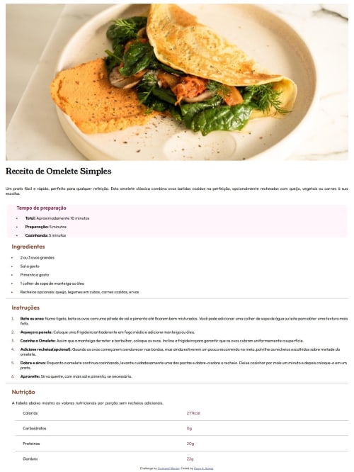
Submitted over 1 year agoA solution to the Recipe page challenge
@media (min-w 1444px), @media (max-w 500px), testei em meu celular
@HNunes22

Solution retrospective
What are you most proud of, and what would you do differently next time?
Me orgulhei de conseguir fazer a reponsividade, e na próxima espero ter mais organização
What challenges did you encounter, and how did you overcome them?Em questão de organização, eu peguei meus cadernos, e tambem usei ChatGPT pra tirar duvidas
Code
Loading...
Please log in to post a comment
Log in with GitHubCommunity feedback
No feedback yet. Be the first to give feedback on H Nunes's solution.
Join our Discord community
Join thousands of Frontend Mentor community members taking the challenges, sharing resources, helping each other, and chatting about all things front-end!
Join our Discord