Design comparison
SolutionDesign
Solution retrospective
Feedbacks are appreciated :)
Community feedback
- @ApplePieGiraffePosted over 3 years ago
Greetings, Tony Tang! 👋
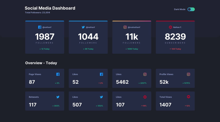
Good job on this challenge! 👏 Your solution looks good and the intro animation that you added to the social media stats cards looks pretty cool! 😀
The only thing that I have to suggest is to add a some sort of focus state (such as an outline or border) to the toggle-switch to let users know when that element is in focus (such as when they tab to that element using their keyboard). 😉
Keep coding (and happy coding, too)! 😁
1
Please log in to post a comment
Log in with GitHubJoin our Discord community
Join thousands of Frontend Mentor community members taking the challenges, sharing resources, helping each other, and chatting about all things front-end!
Join our Discord
