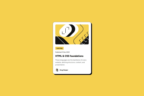
Submitted over 1 year agoA solution to the Blog preview card challenge
MDN Docs, Wave Extension,
accessibility, bem

@coding-vasu
Solution retrospective
What are you most proud of, and what would you do differently next time?
Proud:
Changing root font size scales all rem-based elements proportionally, For screens up to 28.5rem wide: Root font size: 12px (default is 16px) 🖥️
Learn:- To dive deep into the world of CSS and JavaScript animations.
- Crafting interactive elements that bring concepts to life.
Making a responsive blog preview card, especially for small screensSolution: Studied blog posts and tutorials to understand responsive design, focusing on font sizes and rem units
CSS Pseudo-classes Challenge:Understanding :active, :hover, and :focus (for tabindex)Solution: Consulted MDN docs to learn about these pseudo-classes
What specific areas of your project would you like help with? CSS Reset- Question: What is the best CSS reset to use and why?
- Goal: Understanding the advantages of different CSS reset options.
- Guidelines for CSS class naming conventions
- Best practices for CSS file structure
- Comparison of popular CSS reset/normalize options
- Tutorials on implementing BEM or other CSS methodologies
Code
Loading...
Please log in to post a comment
Log in with GitHubCommunity feedback
No feedback yet. Be the first to give feedback on Vasu Vallabh's solution.
Join our Discord community
Join thousands of Frontend Mentor community members taking the challenges, sharing resources, helping each other, and chatting about all things front-end!
Join our Discord