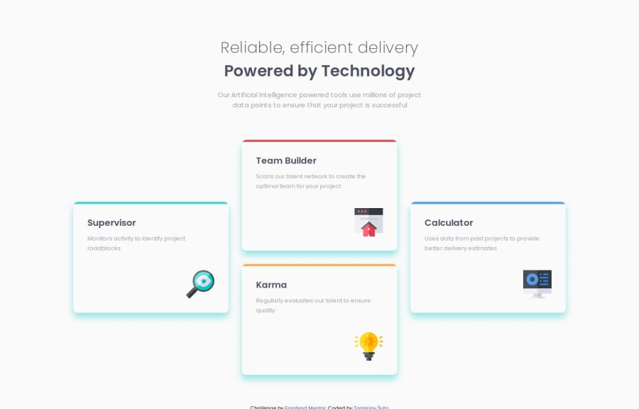


Design comparison

Solution retrospective
Used Grid for the first time. Awesome tool!
Made the transition with the help of Flexbox at a breakpoint, which made things much easier with the mobile layout.
There is nothing I would do differently at the current state of my skills.
What challenges did you encounter, and how did you overcome them?Using Grid.
Went through a couple of hours of research and there were no notable problems.
I had a small problem with positioning an icon on each Card, using ::after. The icon was refusing to touch the bottom of the border because the icon's "container" (or content) was bigger (higher) than it should have been.
- Setting the height of the "container" to be the same height as the icon solved the problem
Community feedback
- P@dearestalexanderPosted 4 months ago
Looks pretty good, nothing much to add. Nice job getting it so close by eye. I guess the shadow colour difference was an intentional choice.
I'm amazed how different out CSS is for the same exercise. Quite different approaches.
I think you said you used flex for mobile and grid for desktop. I used a mix of flex and grid for both. Grid for the cards, but flex on various objects to do things like position icons. It's very easy to switch grid between desktop and mobile just a couple of lines of CSS so might be worth trying that out as well to get more practice with grid. Unless you already know how.
1P@RetroApePosted 4 months ago@dearestalexander
Yup! Getting back and forth between the design image and Preview can take a while. Your kind words make me joyous.
The shadow; I wasn't sure what the color was, so I used the paragraph color. The cards are white, which has been corrected, but I cannot generate a new image to update the change :/
With programming, approaches are always numerous. I cannot say I only used flex for mobile. I actually have a transition when window reaches the width of the grid; this transition is flex with wrap turned on. It turns cards into a 2x2 "grid" and then automatically goes to mobile layout when width further shrinks.
I wanted to compare our approaches and went to see your solution. A bit hard, considering you are into Pokemons. Pretty cool solution, though :)
Thank you for the comment and...
Best of Luck!
0P@dearestalexanderPosted 4 months ago@RetroApe you can click the link in my attribution text to look at my normal solution :) .. my CSS is a bit long because it handles the two designs though, so maybe a bit difficult to compare.
Anyway keep up the good work!
Marked as helpful0P@RetroApePosted 4 months ago@dearestalexander
I like the usage of
margin-top: auto;
align-self: flex-end;
to position the icons; it is much better than my solution. I will remember it. Thank you.
0P@dearestalexanderPosted 4 months ago@RetroApe yes, I've been finding that flex is a great tool for small things. Centring items in a container, putting space between items, moving something to a corner etc! It's super quick and easy to apply. That 'flexbox froggy' game is a good way to get used to that stuff.
0

Please log in to post a comment
Log in with GitHub
Join our Discord community
Join thousands of Frontend Mentor community members taking the challenges, sharing resources, helping each other, and chatting about all things front-end!
Join our Discord