Design comparison
SolutionDesign
Please log in to post a comment
Log in with GitHubCommunity feedback
- @yhuteemoren
Hello kaleb birhanu, good job on completing your challange.
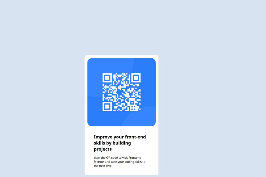
You have done so well with your code, however, adding margin to your div component would have removed the overflow from the design.
Join our Discord community
Join thousands of Frontend Mentor community members taking the challenges, sharing resources, helping each other, and chatting about all things front-end!
Join our Discord
