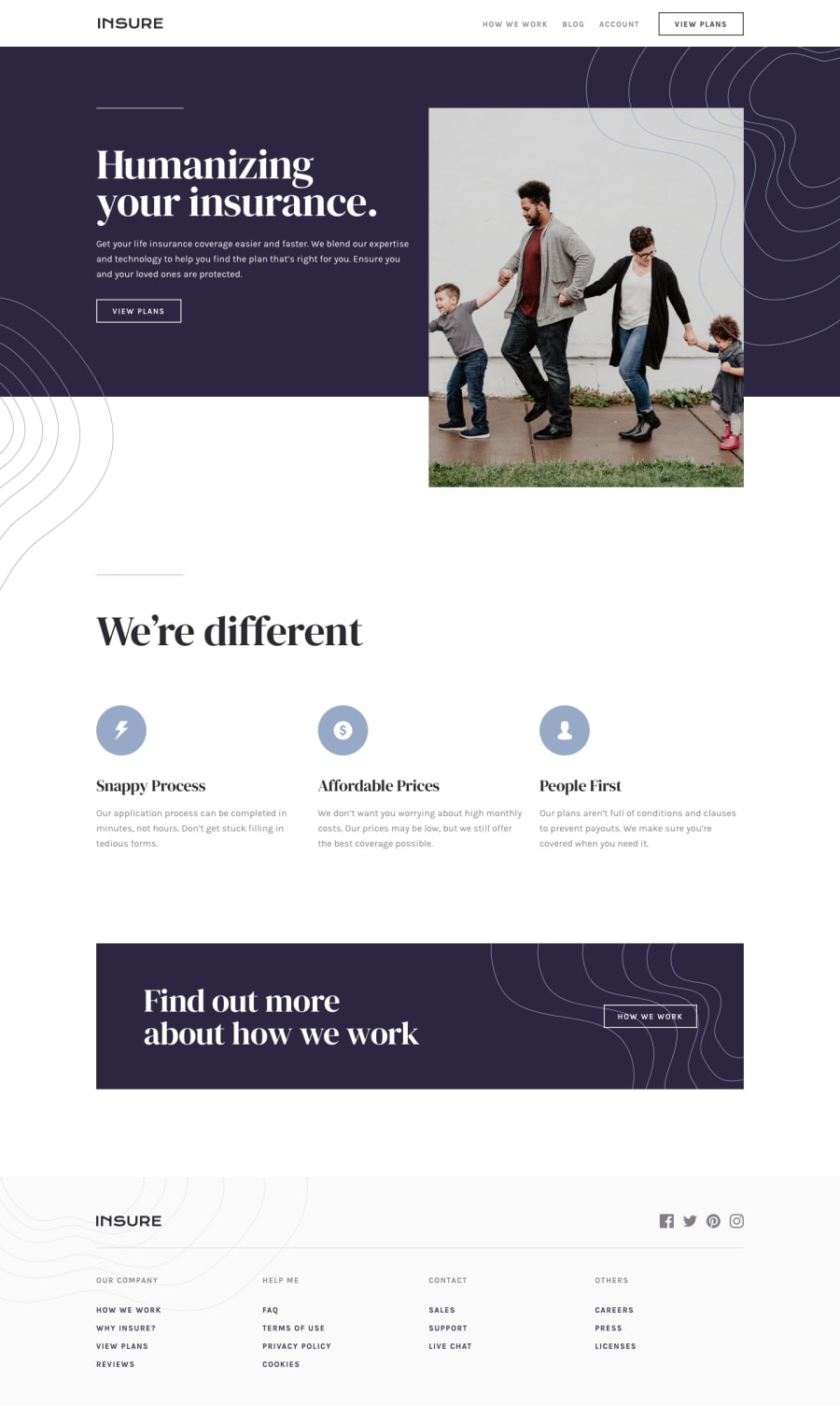
Design comparison
Solution retrospective
Please be meticulous :3
Community feedback
- @mattstuddertPosted almost 5 years ago
Nice work, Ihor! Overall you've done a really good job on this challenge. As you can see by the design comparison there are still some CSS refinements that you could make. Having that attention to detail is a key skill of a front-end developer, so it's well worth spending the time getting your solution looking as close to the design as possible.
One other thing is that you've got click listeners on
imgelements for the mobile navigation. I'd recommend avoiding adding click listeners on non-interactive elements. This is because they will be inaccessible to people who can't use a mouse/trackpad to navigate the website. Instead, use anchors or buttons to trigger events, as these are interactive elements and can be focused by the user without the trackpad.Let me know if you have any questions. Keep up the great work!
0 - @lailton-bPosted almost 5 years ago
Hahahah, yeah, i found it a bit complicated too. Great job!!
0
Please log in to post a comment
Log in with GitHubJoin our Discord community
Join thousands of Frontend Mentor community members taking the challenges, sharing resources, helping each other, and chatting about all things front-end!
Join our Discord
