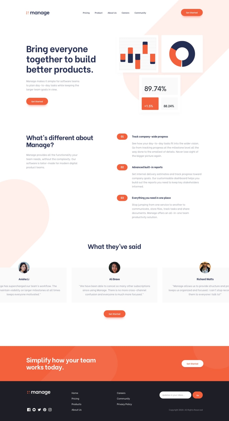
Design comparison
Community feedback
- @brunomoletaPosted 6 months ago
Hello NiLoBol,
Please check the Pull Request at Github. I reviewed specially the html and Vue architecture of the project.
I divided the components into smaller parts and refactored your Button component so there was no repetition, and it's easier to read.
Please check the commits to understand the HTML semantics I put in there. You only used
divs, which carry no semantic meaning. I changed them toform,section,header,main, andfooter.Also, I removed the raw strings from the components and put it all in .json files.
The hook you created for the Testimonials is neat. I had not yet seen that, congratulations.
Best regards from 🇧🇷 :)
Marked as helpful1
Please log in to post a comment
Log in with GitHubJoin our Discord community
Join thousands of Frontend Mentor community members taking the challenges, sharing resources, helping each other, and chatting about all things front-end!
Join our Discord
