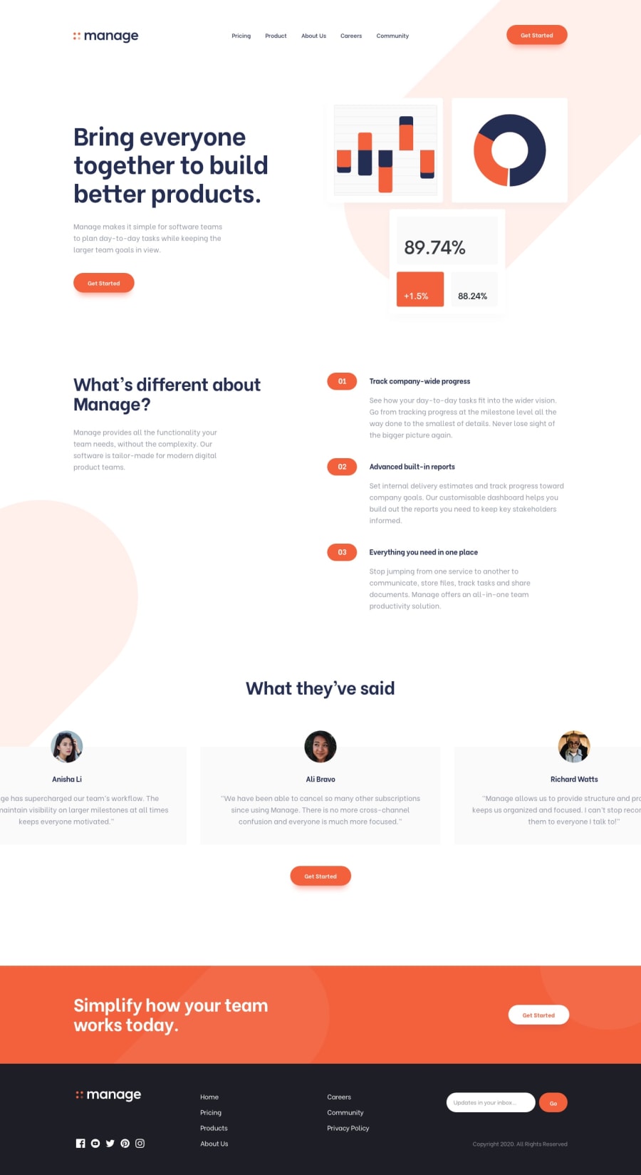
Design comparison
Solution retrospective
HI, Community hopes to Help me with a good way to show this bg tablet pattern.SVG on the right place as I did it by position absolute but find out that the page has an x direction scroll So I put overflow-x on the body but nothing changed.
I Tried To change the relative and some other thing but end up with the same result so I removed it and decided to upload it without the tablet
hope you give me Your opinion on the Work done on this project
Community feedback
- @IlesanmieaPosted about 2 years ago
Hello Khalil, Glad you attempted this challenge and completed it, CONGRATULATIONS!!!
Well I personally previewed your codes and your websites both the desktop view and the mobile view so I came up with these suggestions to help your codes to be better.
- Regarding the domain name for your site, try to avoid using your name as the domain or subdomain name for a project like this since it's not your portfolio. These are the reasons below
- Use the name related to the project for domain name during hosting. For a project like this, try to use managehurdle.github.io , manage.github.io e.t.c if taken try another related name to the project you are working on which sometimes even exercise your critical thinking.
-The reason to avoid your name is look professional to recruiters. Also when sharing with familes, friends,strangers e.t.c It gives them an insight into what they want to visit.
- For the background images: I suggest you nest them within the
htmltag and thebodytag on the CSS external files. This code snippets work for me
    background-image:url('images/bg-tablet-pattern.svg');
    background-repeat: no-repeat;
    background-position: bottom 45% left -350px;
    background-size: 50%;
    font-family: rocko;
}

body{
    padding: 4vw;
    background-image: url('images/bg-tablet-pattern.svg');
    background-repeat: no-repeat;
    background-size: 60%;
    background-position:top -100px right -190px;
    color:rgb(36, 45, 82) !important;
}```

I copied this from my solution to this particular challenge so as to give you idea to how you could solve these problems. With the help of `background-position:` in CSS you could be able to adjust them to suitable screen sizes but you can try to check on my own codes solution to this on Github [ilesanmiea](https://github.com/Ilesanmiea/manage.github.io).

But **Khalil** you have done amazing well, I like your CSS custom properties. In all you do, always remember that Sky is not your limit but Heaven is.

**Happy Coding!!!**
0
Please log in to post a comment
Log in with GitHubJoin our Discord community
Join thousands of Frontend Mentor community members taking the challenges, sharing resources, helping each other, and chatting about all things front-end!
Join our Discord
