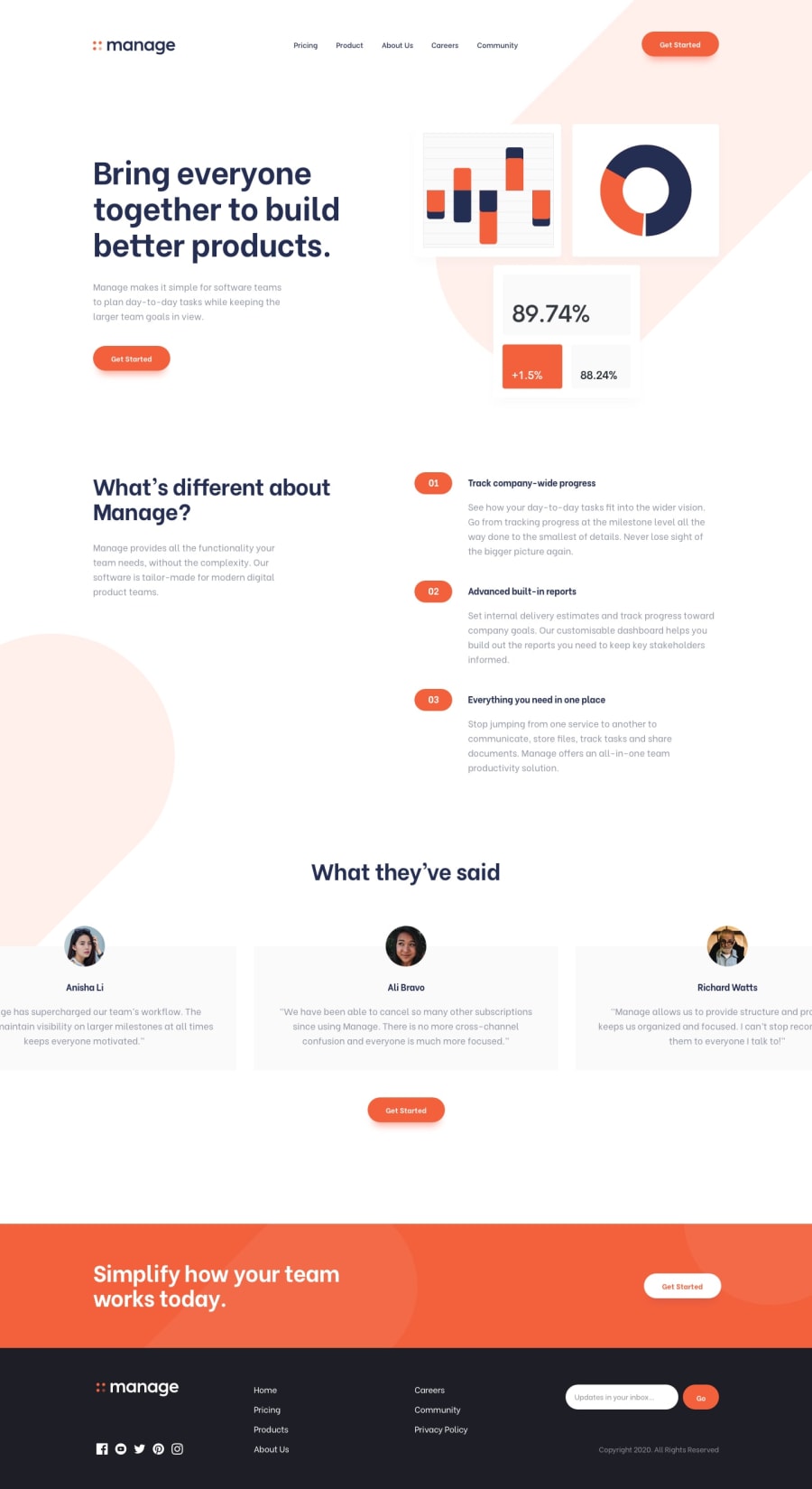
Design comparison
SolutionDesign
Solution retrospective
Quite a heavy design, any suggestion is welcome.
Community feedback
- Account deleted
Hi,
I also recently did this challenge and it was quite challenging, so big up for taking it on;
- Give the navigation bar some space at the top like in the design, it'll sure look a lot better.
- The testimonial section should have four people, yours currently have three, don't know what happened to the other one... Ok the other one shows when you click and hold down on the section, not sure if that's a good way to do it since I stumbled upon it by accident.
- You should work on the responsiveness, it doesn't look very good.
- The shadow from the mobile menu gets carried over to the desktop when you switch without dismissing it.
Marked as helpful0 - @sarajlijaPosted about 3 years ago
Thanks for the suggestions, it's a little difficult to fix something without something else breaking, especially if it looks completely different on different browsers or devices, I noticed some mistakes after deployed site. JS and some libraries provides a lot of solutions for the slider.You are right, there are more elegant solutions for the desktop version. I will fix that.
0
Please log in to post a comment
Log in with GitHubJoin our Discord community
Join thousands of Frontend Mentor community members taking the challenges, sharing resources, helping each other, and chatting about all things front-end!
Join our Discord
