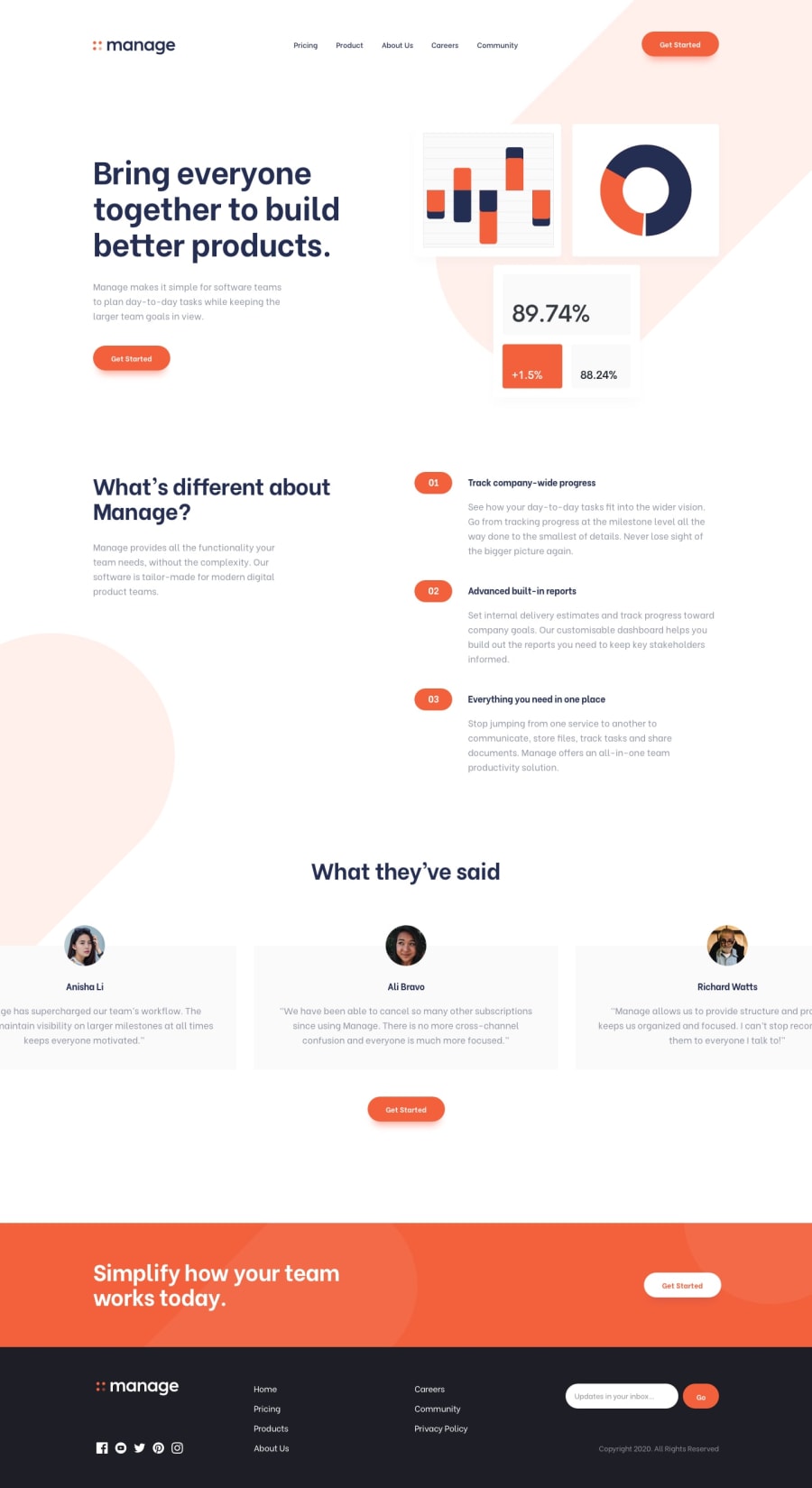
Design comparison
SolutionDesign
Community feedback
- @Katleho-codesPosted about 2 years ago
Hey! Nice work. Although the testimonial cards are nowhere the same as the original design. You could try using position: absolute, and also increase the padding in the navigation bar.
0
Please log in to post a comment
Log in with GitHubJoin our Discord community
Join thousands of Frontend Mentor community members taking the challenges, sharing resources, helping each other, and chatting about all things front-end!
Join our Discord
