Design comparison
SolutionDesign
Solution retrospective
hey guys .. im waiting your feedbacks ;)
Community feedback
- @ApplePieGiraffePosted about 4 years ago
Nice job, Dark-Lover! 😃
Your solution looks good and seems to respond well! 🙌
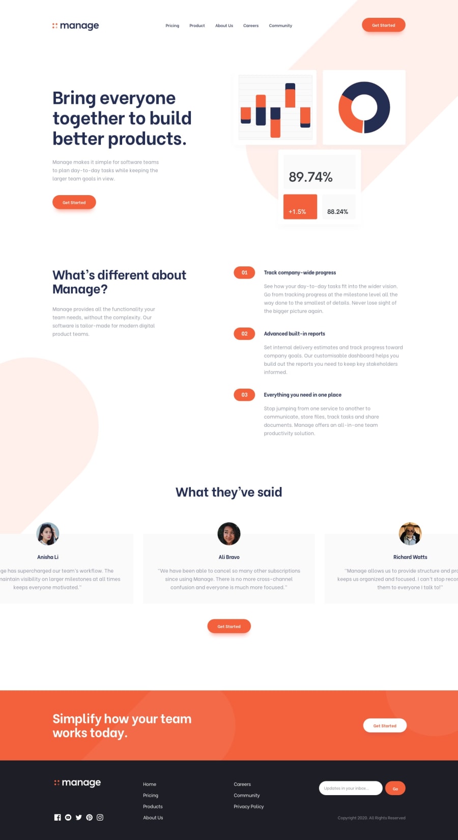
- There just seems to be some extra white space on either side of the footer at the bottom of the page.
- And I think the text input in the footer of the page could be a little wider so that all of the placeholder text is shown.
Keep coding (and happy coding, too)! 👍
1@Dark-LoverPosted about 4 years agoThank you @ApplePieGiraffe I will take that your remarks in consideration 😉
0
Please log in to post a comment
Log in with GitHubJoin our Discord community
Join thousands of Frontend Mentor community members taking the challenges, sharing resources, helping each other, and chatting about all things front-end!
Join our Discord
