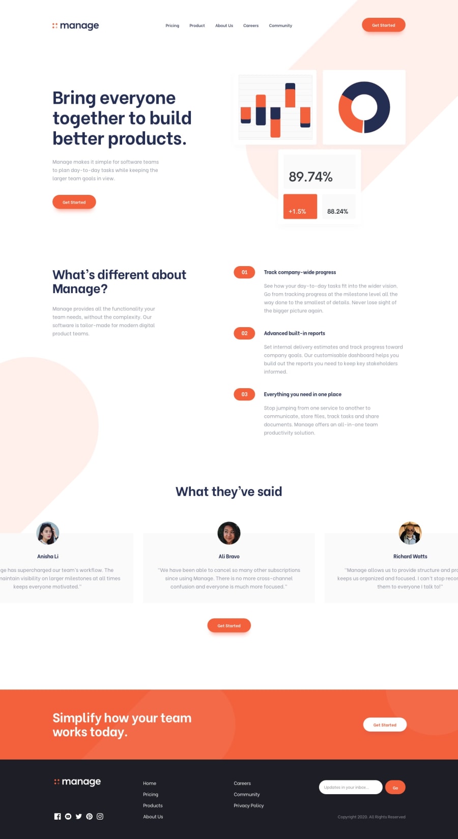
Manage Landing page with Tailwindcss
Design comparison
Community feedback
- @NoelaOstPosted about 2 years ago
Hi Haroon! Love your project result. Great job!
I have some advice for you that could help fix some small things on your styling.
- On your background you an easily add another bg-tablet.svg simply by adding another background position and separating it with comma. Like so:
background-position: 50px -350px, 300px 600px;
- Another thing is light red background that appears on 3 sub headings on the smaller screens sizes. Notice how on the right side they go all the way to the end of the screen. There is actually very easy solution for that. You simply add box shadow in the same color as background, e.g. :
box-shadow: 5em 0 0 var(--pale-red);
It will fill up desired space without spilling out of its container.
Also, I really like how you did your readme file. How did you make those screenshots of different screen sizes? I'd like to do the same for my project. Thanks in advance.
Happy coding:)
Marked as helpful0@HaroonabdulrazaqPosted about 2 years ago@NoelaOst , Thanks for taking the time to review my project. I will definitely check through my code and make the necessary changes.
The screenshot was gotten from https://ui.dev/amiresponsive
0 - @VCaramesPosted about 2 years ago
Hey @Haroonabdulrazaq, some suggestions to improve you code:
-
The logo Alt Tag in the logo needs to be improved upon. The logo is arguably the most important image in you page. So the description should state the company name and what it is.
-
The Nav has to be wrapped by the Header Element.
-
Your Nav menu has to created using a Unordered List.
-
When you use images/icons, you want to include an Alt text tag with them. Inside that Alt Tag you want to describe what the image is; they need to be readable. Assume you’re describing the image/icon to someone.
If the image/icon is decorative, then you will leave the Alt tag blank; alt=“”
-
The Social Media icons Alt Tag needs to tell the screenreaders users where it leads to at.
-
The "Track company-wide progress", "Advance built-in report", and "Everything you need in one place" are created using an Unordered List.
-
The Input Type for the email has to email not text. This will the browser know what goes in here.
-
Add a Media Query to you footer around 776px; Everything gets squished.
Happy Coding!
0@HaroonabdulrazaqPosted about 2 years ago@vcarames Thank you for your feedback
0 -
Please log in to post a comment
Log in with GitHubJoin our Discord community
Join thousands of Frontend Mentor community members taking the challenges, sharing resources, helping each other, and chatting about all things front-end!
Join our Discord
