Submitted about 3 years agoA solution to the Manage landing page challenge
manage landing page with html/scss
sass/scss
@FayssalG

Solution retrospective
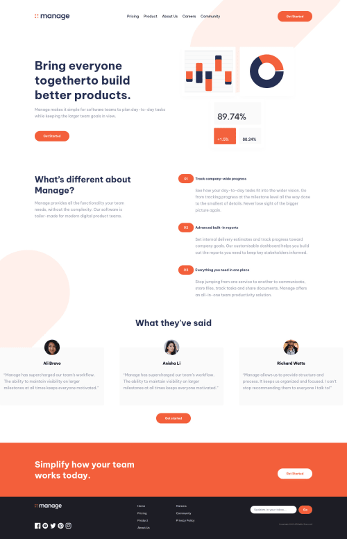
This one was a little tricky it took me longer than I expected, the tricky part was positioning the background pattern on the top right and making it responsive I used ::after to do it I wonder if there is a better way
Code
Loading...
Please log in to post a comment
Log in with GitHubCommunity feedback
No feedback yet. Be the first to give feedback on FayssalG's solution.
Join our Discord community
Join thousands of Frontend Mentor community members taking the challenges, sharing resources, helping each other, and chatting about all things front-end!
Join our Discord