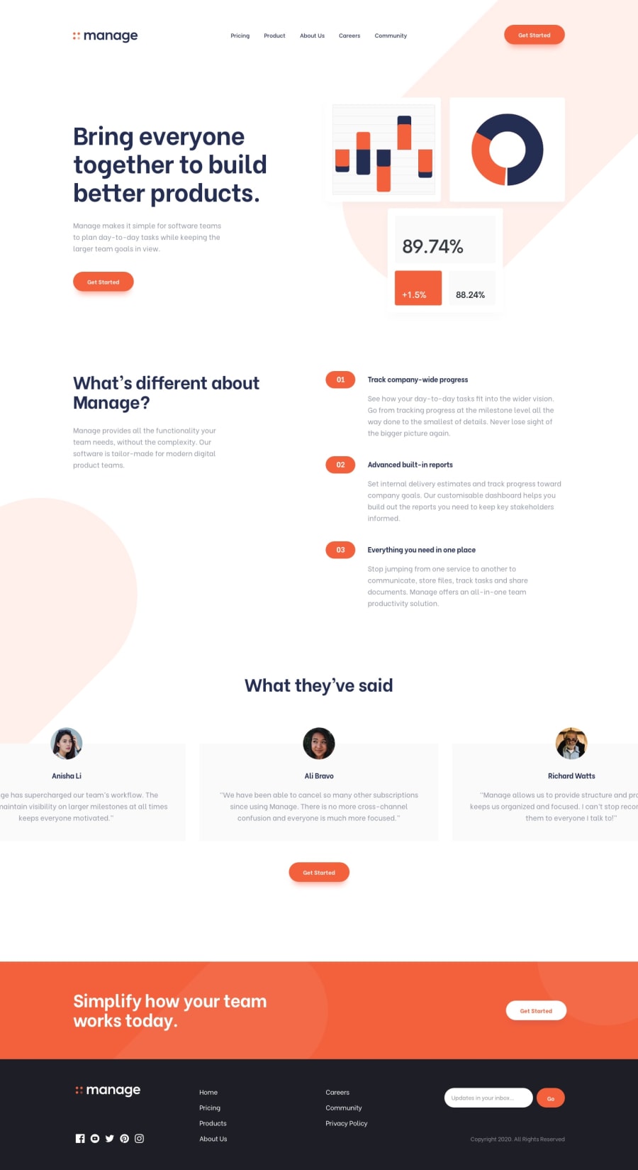
Design comparison
Solution retrospective
Hi everyone! ☕️
This is my solution to the challenge. It helped me clarify several Vue concepts, but there's still a long way to go with this framework. One thing I haven't fully mastered is positioning elements in the background, in this case, the round red shapes. If you have any recommendations on how to better position them, it would be greatly appreciated. Anyway, I will try to keep improving some things in this challenge, but I think it looks good to upload the solution.
If you have any feedback on how I could improve my code, found any errors, or anything else that you think should be mentioned, I would greatly appreciate it.
Thanks and have a great day. 👌🏼
Community feedback
- @nibess1Posted over 1 year ago
Good solution, just one small comment:
At smaller screen sizes, you could perhaps increase the height of the carousel instead? The overflow makes it difficult to read.
Happy coding :"D
0@hectorolivaresPosted over 1 year agoHi @nibess1, thanks for your comment. 👌🏼
For this challenge, I implemented two types of carousels, one that only activates for mobile devices and another one for desktop versions. That's why, even if you resize the window in the desktop version, the carousel won't change and will appear with overflow. However, if you access it from your mobile device, you will see the other carousel I mentioned. I'm not sure if this is considered a good practice, but it looks good in both versions.
1
Please log in to post a comment
Log in with GitHubJoin our Discord community
Join thousands of Frontend Mentor community members taking the challenges, sharing resources, helping each other, and chatting about all things front-end!
Join our Discord
