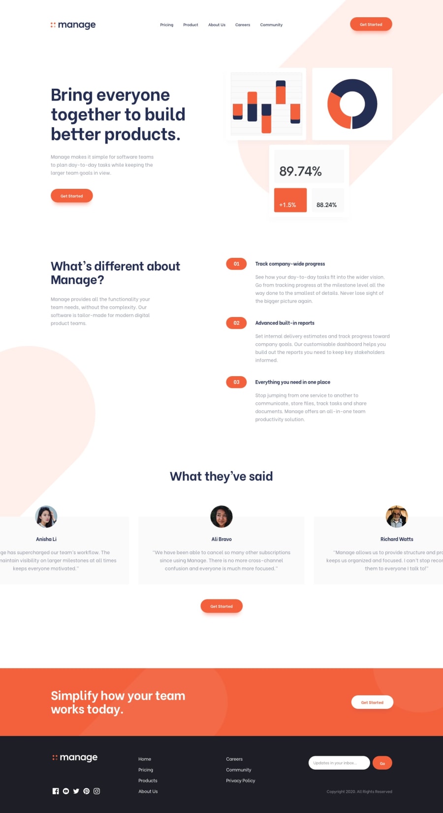
Design comparison
Solution retrospective
Thank you for checking out my first landing page project using React! It wasn't easy but I had a lot of fun :) If you have any feedback, please kindly leave a comment. Thank you again and happy coding!
Community feedback
- @karenefereyanPosted over 3 years ago
Nice work Hyunji. Just a few notes:
- Pricing Link in the mobile nav seems cut out of the container. Could be the paddings. Check it out.
- There's horizontal scrolling on the page. I'm not sure why. Overall its cute. Happy coding😊😊😊
0@creativehkimPosted over 3 years agoThank you for your comment! I have no idea why it's scrollable...I assume it's because of the Swiper library I used. I will keep looking to solve this problem and the first issue also. Thank you so much! :)
0 - @palgrammingPosted over 3 years ago
Your solution looks nice
It seem like you are missing the breadcrumb like dots in the what they are saying section for the mobile view even more weird it does not seem that the challenge has anything like that for the other views. I was lost for a min not building this project yet that I could scroll through them myself. Seems like it needs some arrows that appear on hover or something
0@creativehkimPosted over 3 years agoThank you for your comment. I thought it worked fine when I checked on Chrome before deploying but I honestly have no idea why it's scrollable now...I think it's something to do with the Swiper library I used for the testimonial section. I will look for the solution and fix this problem. Let me know if you have any suggestion. Thank you!
0
Please log in to post a comment
Log in with GitHubJoin our Discord community
Join thousands of Frontend Mentor community members taking the challenges, sharing resources, helping each other, and chatting about all things front-end!
Join our Discord
