Design comparison
Solution retrospective
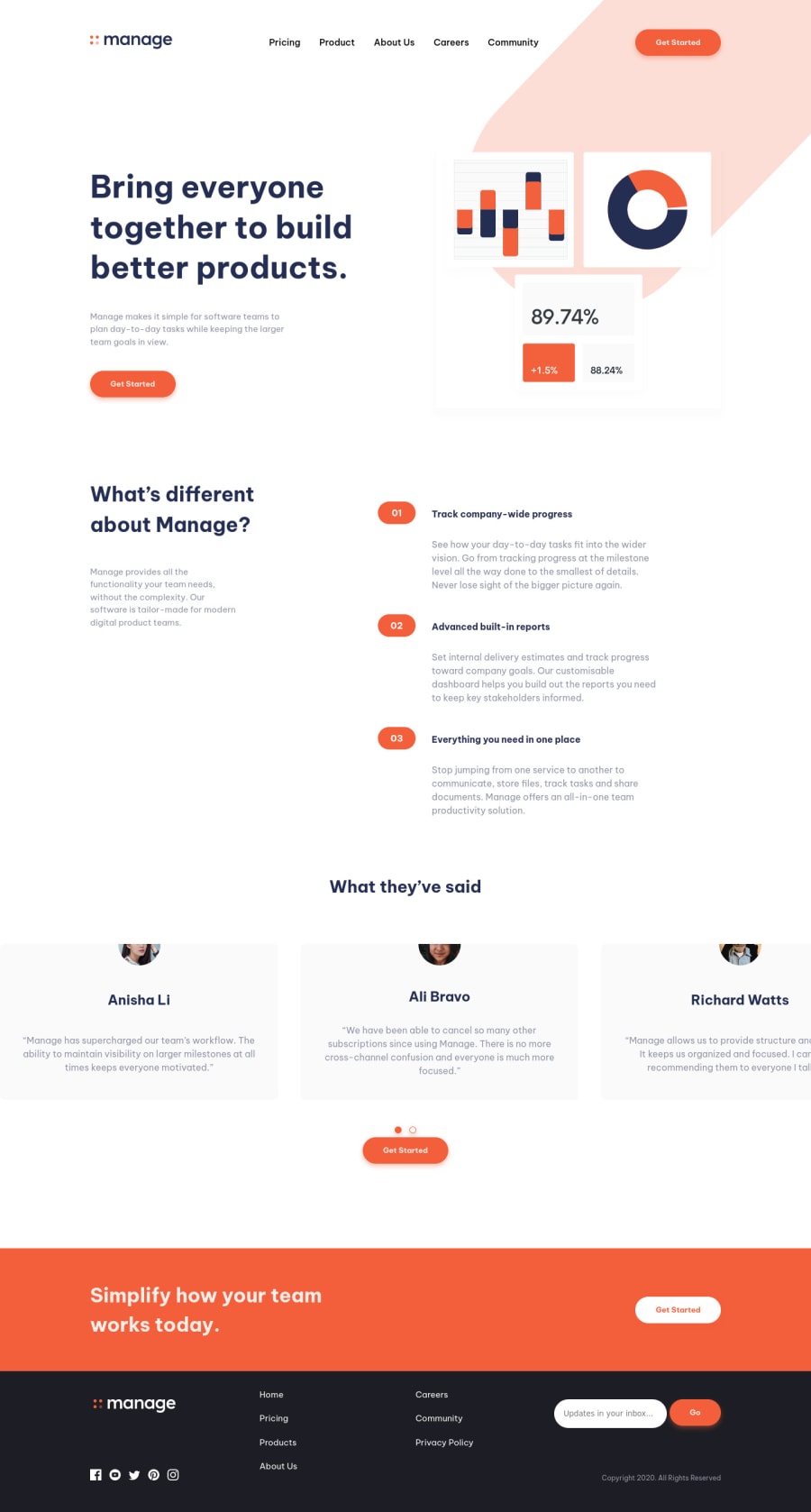
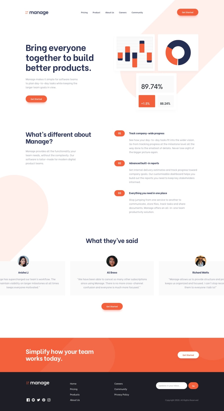
I did my best on this challenge and really tried to do it pixel perfect, but I couldn't understand why my carousel keeps cutting the photos... if anyone can help me about this, I did it using Glider.js !
Community feedback
- @stfnpczkPosted almost 3 years ago
Hi Kiyoomi,
I think the issue can be fixed, if you use
padding-topinstead ofmargin-topwithintestimonials .cards1@JukiyoomiPosted almost 3 years ago@stfnpczk OH it worked ! Thank you Stefan ! But I don't understand why...
0@stfnpczkPosted almost 3 years ago@Jukiyoomi I believe it’s because your content display is restricted by the size of
draggableflex container. With padding you extend the border of that container, whereas with margin the space is outside of the flexbox and is therefore cut off.0
Please log in to post a comment
Log in with GitHubJoin our Discord community
Join thousands of Frontend Mentor community members taking the challenges, sharing resources, helping each other, and chatting about all things front-end!
Join our Discord
