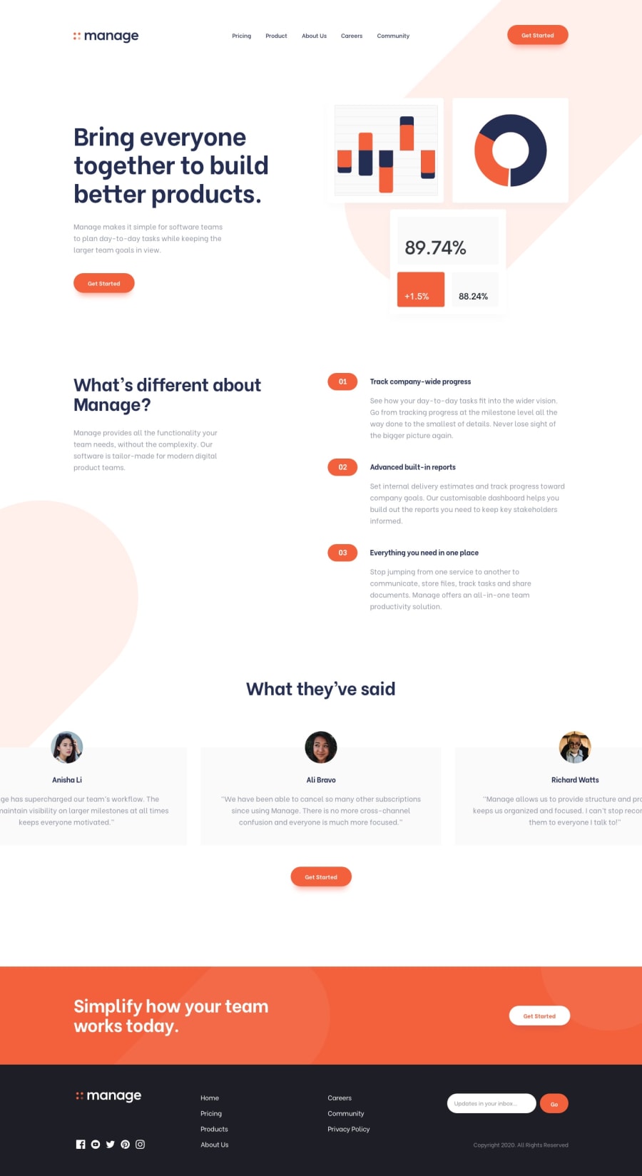
Design comparison
Solution retrospective
Hello, Frontend Mentor coding community. This is my solution for the Manage landing page using Mobile First approach.
The development of this page was very chaotic for me. I did it a first time yesterday, but I encountered a lot of problems when working on the desktop part after finishing the mobile view. I had some problem with my HTML structure, and I decided to call it a day. Next day, I decided it was better to start from zero again, I learned a lot on what was wrong the first time, what I could improve and this is the result I have after 3-4 hours of work. I haven't done the javascript part because it wasn't my priority for this challenge. I feel like the final result is not too bad, I could refine it a little more, but with all the difficulties I've got, I'm happy with it for now.
Feel free to leave me a constructive feedback on my work !
Community feedback
- @mohamed-benoughidenePosted about 2 years ago
Hi Laharl great work completing this challenge but there is a mistake in your html its not right to do this
  <nav>
        <ul><li>Pricing</li></ul>
        <ul><li>Product</li></ul>
        <ul><li>About Us</li></ul>
        <ul><li>Careers</li></ul>
        <ul><li>Community</li></ul>
      </nav>
there is no need to use UL element like this instead do this
 <nav>
        <ul>
<li>Pricing</li>
       <li>Product</li>
       <li>About Us</li>
       <li>Careers</li>
     <li>Community</li>
  </ul>
      </nav>
I hope you find this helpful
1
Please log in to post a comment
Log in with GitHubJoin our Discord community
Join thousands of Frontend Mentor community members taking the challenges, sharing resources, helping each other, and chatting about all things front-end!
Join our Discord
