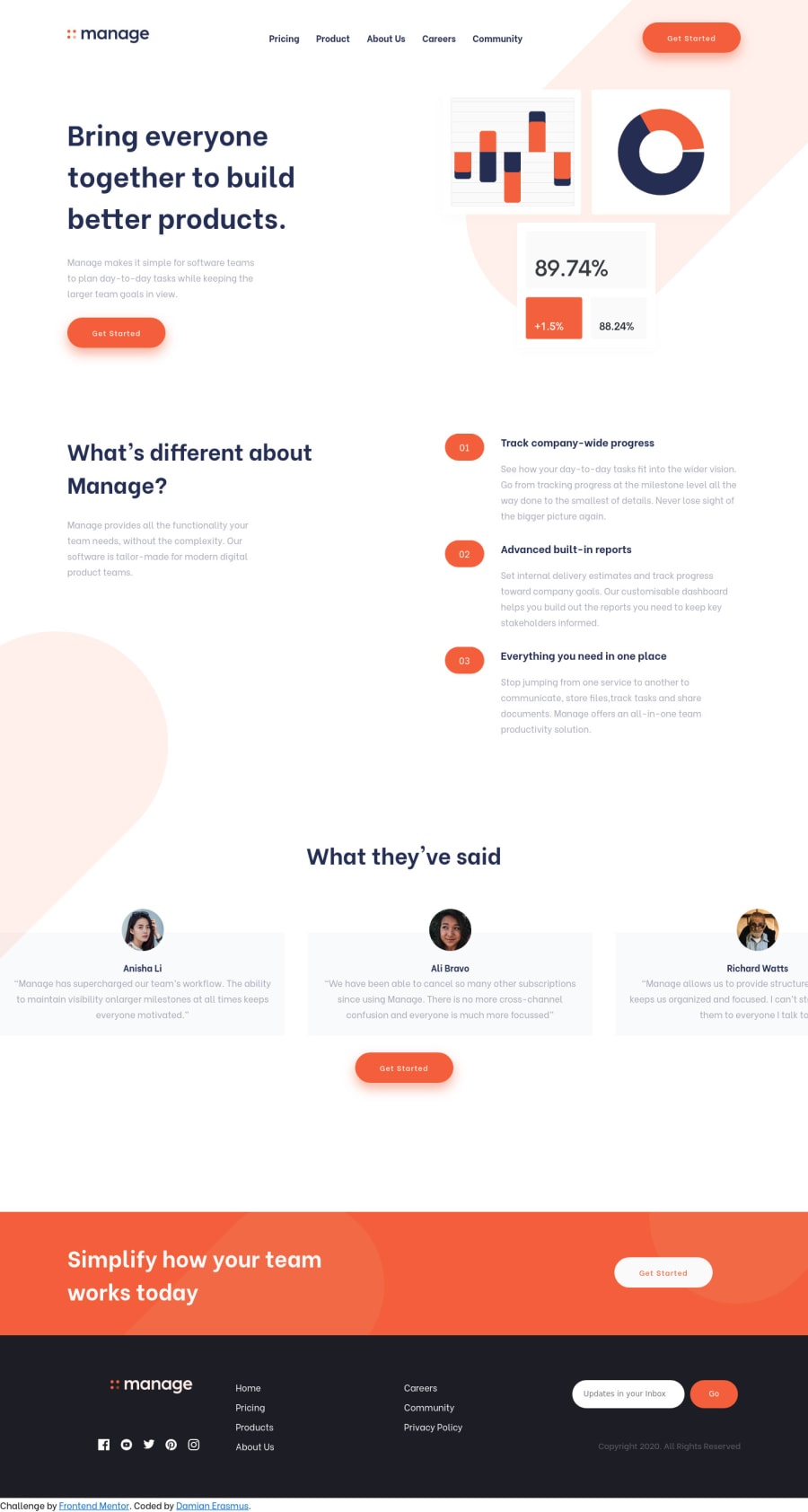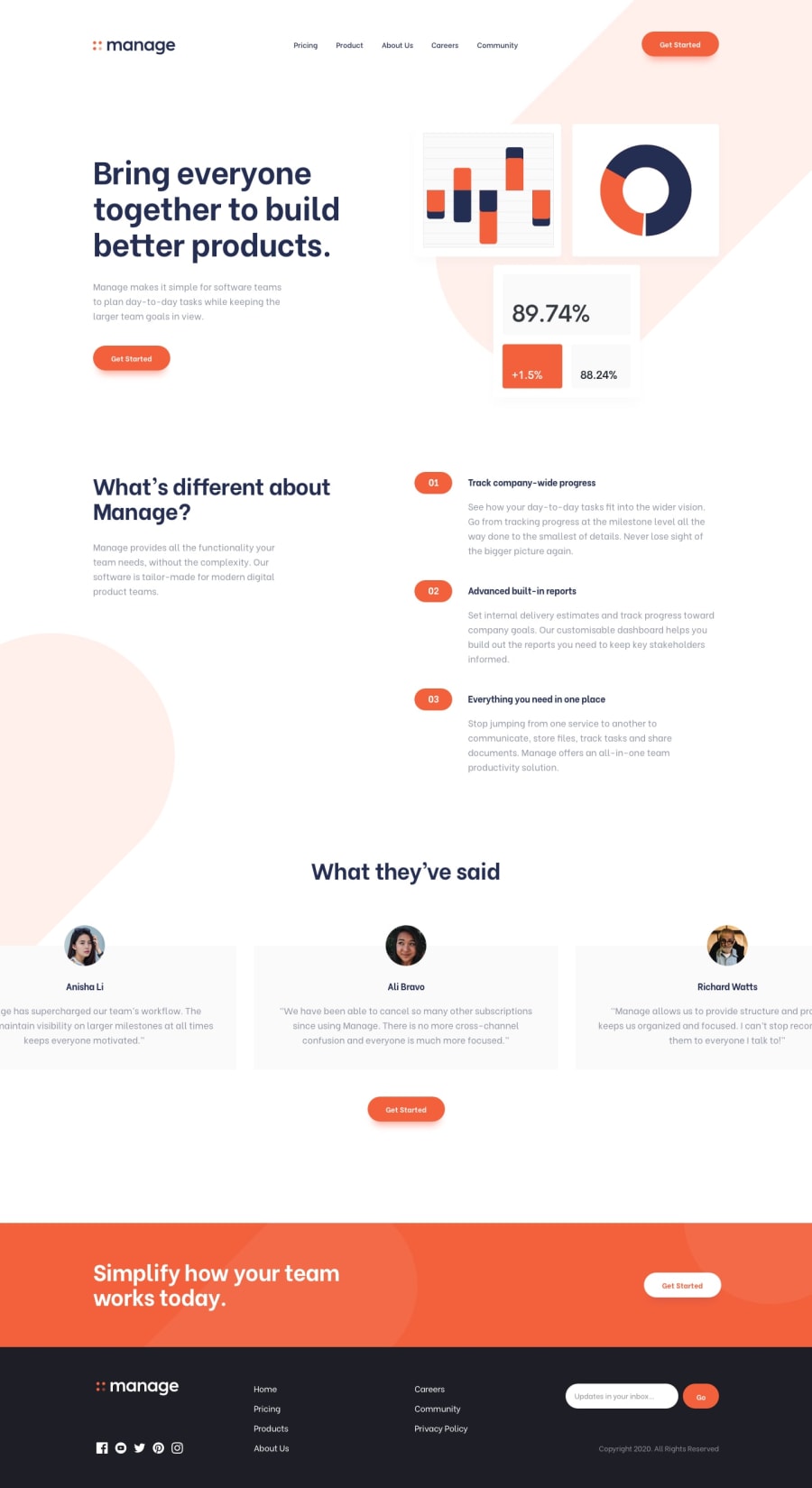
Manage Landing Page using HTML, CSS and Javascript
Design comparison
Solution retrospective
Did I miss anything?
Community feedback
- @AllanKiruiPosted over 3 years ago
Hi Damian. First of, I'd like to say that you've done a good job. Not many people who started this challenge have finished it. So feel proud of yourself.
What I would suggest is that you work on the responsive design a little bit more. I noticed that when you resize the screen from desktop to mobile devices, somewhere in the middle before the mobile breakpoint, things look really crammed and start to overflow.
For the testimonial sliders, I would suggest that you use a plugin such as Flickity (https://flickity.metafizzy.co/). It will allow you to easily create beautiful sliders that can be customized to meet your needs.
Also, try to link to your Frontend Mentor profile on the part that says, "Coded by Damian Erasmus". At least this way, when people click on the link, they will be brought to your Frontend Mentor profile instead of the link just refreshing the page. This will also help others to view your other solutions and give you more feedback incase you need some.
And if you feel like you need some more help in writing code that matches the designs as close as possible, have a look at this GitHub repository. (https://github.com/AllanKirui/designing-and-coding-layouts)
2 - @repzy001Posted about 2 years ago
Hi Damian, very great work indeed, its nice for you to have given this a try and actually almost finish it, majorly what is missing is the responsive design of it cause it doesn't look good on mobile and also the testimonials on the desktop version are all far overflown
keep up the good work
0 - @DmytroTarasiukPosted over 3 years ago
Hello Damian! Your website looks very good on a laptop version, you did a great job. However, the "swiper-slide testimonial" div with a name of Richard is an out of a page. Also, you should make a website to be responsive because it looks confused on a mobile version. That's all I've noticed. Have a fun coding ;)
0 - @benjoquilarioPosted over 3 years ago
Great! It's good.
I observe there is overflowing in the right side on my screen. I guess it in the button on the navigator and check the
accessibility issuesandHTML issueskeep coding.
0
Please log in to post a comment
Log in with GitHubJoin our Discord community
Join thousands of Frontend Mentor community members taking the challenges, sharing resources, helping each other, and chatting about all things front-end!
Join our Discord
