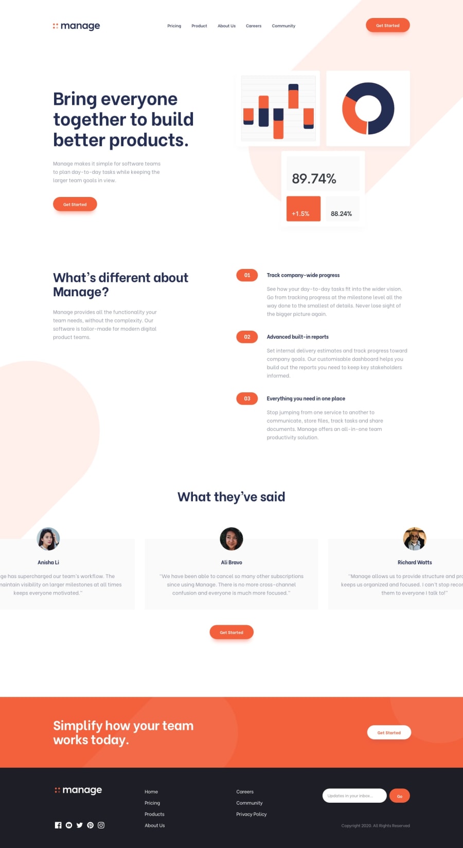
Design comparison
Solution retrospective
Last landing page I had to do with free version. Lots of fun !
Community feedback
- @ChamuMutezvaPosted over 3 years ago
Nice work PierreWagon, I checked it on mobile and it is looking pretty good. One suggestion is to make the nav items an unordered list
1@pierre-pellegrinoPosted over 3 years agoHey @ChamuMutezva, thanks a lot !
I've read some time ago that it was better to use this syntax
<nav>
    <a>
    <a>
    <a>
</nav
Rather than lists. Do you think using list is a better way ? If so, I will surely do like this next time 😊
0@ChamuMutezvaPosted over 3 years ago@PierreWagon, I would prefer a list as it does assist people who rely on assistive technology - they can be notified of how many items in the list and the current position when tabbing.
0@pierre-pellegrinoPosted over 3 years ago@ChamuMutezva That's fair, thanks a lot 😀
0
Please log in to post a comment
Log in with GitHubJoin our Discord community
Join thousands of Frontend Mentor community members taking the challenges, sharing resources, helping each other, and chatting about all things front-end!
Join our Discord
