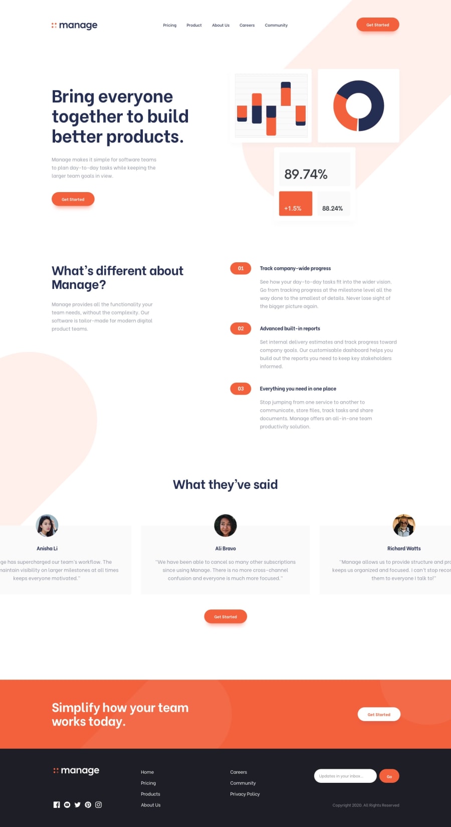
Design comparison
SolutionDesign
Community feedback
- @ramsaysewellPosted over 4 years ago
Hi Dosunmu Afeez,
This solution is pretty close to perfect, well done!
The only misalignment that I can spot on the page is down in the footer at a mobile device width. I think you might just be missing a class of
.px-5on the container of the newsletter box. Just so that it aligns better with the rest of the footer content.I really like the owl-carousel, this has been configured really well and responsively.
Congrats!
Ramsay
1
Please log in to post a comment
Log in with GitHubJoin our Discord community
Join thousands of Frontend Mentor community members taking the challenges, sharing resources, helping each other, and chatting about all things front-end!
Join our Discord
