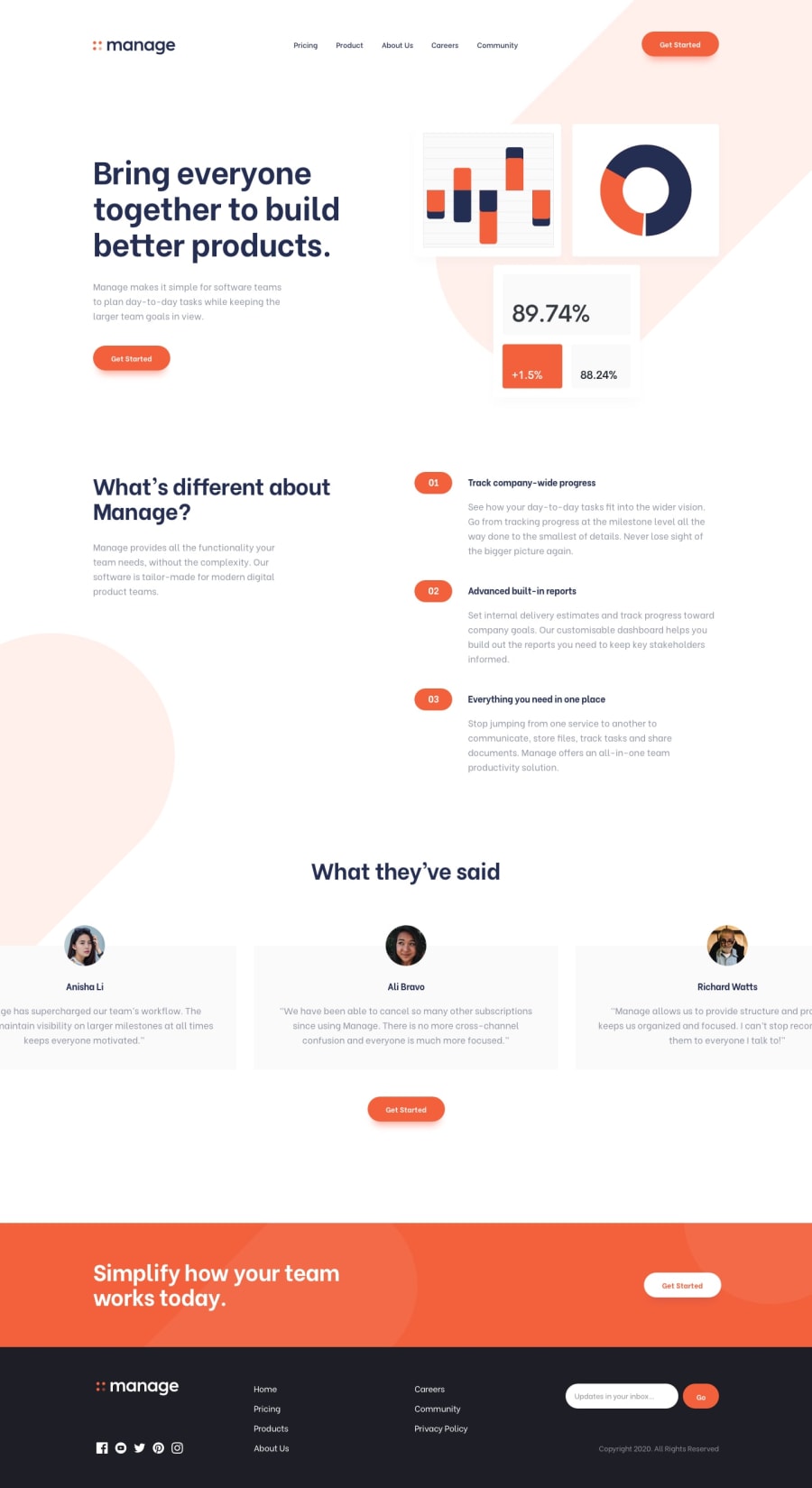
Design comparison
SolutionDesign
Solution retrospective
What are you most proud of, and what would you do differently next time?
I would start the layout by the mobile version and use more responsive units.
What challenges did you encounter, and how did you overcome them?I had some difficult with the use of position and also i took more time on the carousel that i liked, only because I put more complexity at it that it actually needed. The answer was "just use transitionX".
Community feedback
Please log in to post a comment
Log in with GitHubJoin our Discord community
Join thousands of Frontend Mentor community members taking the challenges, sharing resources, helping each other, and chatting about all things front-end!
Join our Discord
