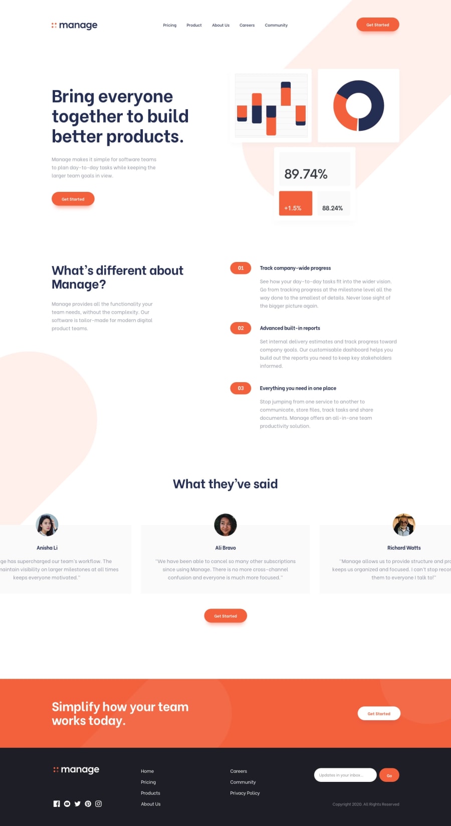
Design comparison
SolutionDesign
Solution retrospective
It was a bit challenging, mostly the footer section, because it's completely different on both mobile and desktop size, but I loved how I managed it with grid layout. :)
Community feedback
Please log in to post a comment
Log in with GitHubJoin our Discord community
Join thousands of Frontend Mentor community members taking the challenges, sharing resources, helping each other, and chatting about all things front-end!
Join our Discord
