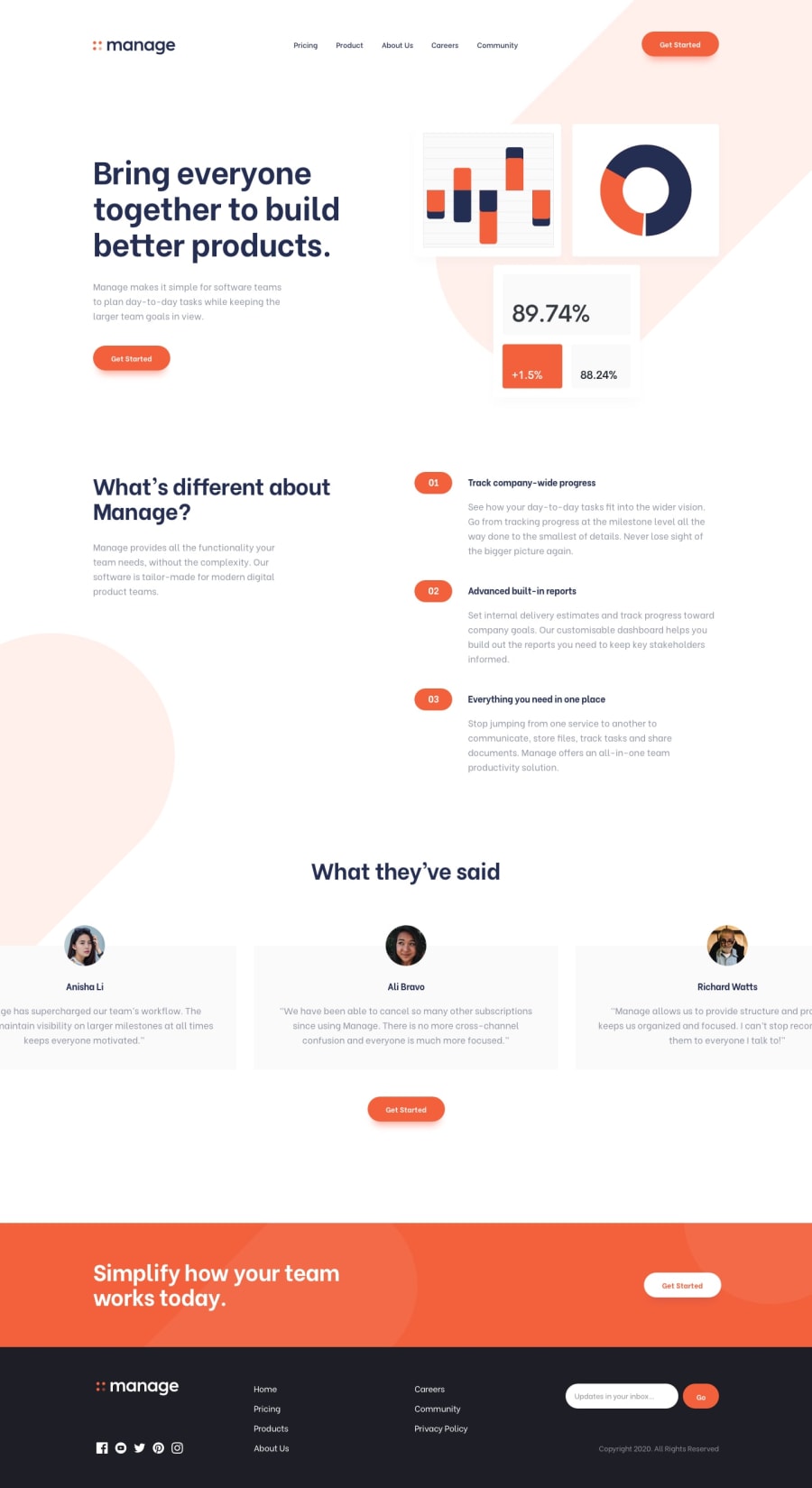
Design comparison
Solution retrospective
Hi, guys! This is my solution to the Manage Landing Page challenge. Please give me some feedback if you can. Thanks! πππ...
Community feedback
- @niemalPosted over 1 year ago
Hey there,
The accessibility report is a good place to start getting feedback from, perhaps you would like to start from there. I have no access to a desktop right now so I will be reviewing the mobile version only.
The implementation looks lovely overall but there is something that should be noted and fixed: when I click on the small dots below the feedback cards nothing happens. I expect the horizontal scroll view to scroll on a specific card when that happens.
That's about it for all I can look at right now, wish you fun going forwards!
Marked as helpful0@rafaeldevvvPosted over 1 year ago@niemal Hey there. Thanks for the feedback! Appreciate it! Do you know how I can fix the accessibility thing? Do I have to put some text inside the links in a span and hide it with display: none; or something like that?
0@niemalPosted over 1 year ago@rafaeldevvv I am not sure but you could try a hacky solution with opacity 0 and little to 1 character (s):
<i class="etc"><a style="opacity: 0">INVI</a></i>
You get the idea I hope. Make the
i
element position relative and the a an absolute ontop beneath. Probably not the way to go with, but it's something.Marked as helpful0
Please log in to post a comment
Log in with GitHubJoin our Discord community
Join thousands of Frontend Mentor community members taking the challenges, sharing resources, helping each other, and chatting about all things front-end!
Join our Discord