Design comparison
Solution retrospective
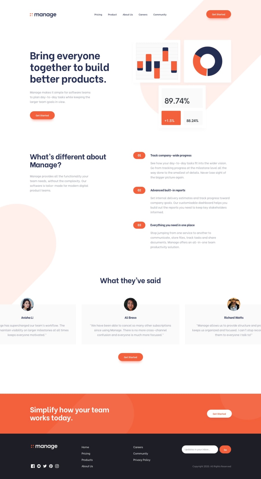
I completed another challenge but i'm not 100% happy with this one :), quick one for you, how have you managed to have bigger svg sizes on the footer and applying the hover effect when pointing on the anchor tag (was trying something like a:hover > svg, not working),yeah the footer is a weird one, overall it was a good practice. If you have any recommendation on how i can improve this code send it on, i appreciate have a nice week end !
Community feedback
- @VincenzoMarcovecchioPosted almost 5 years ago
Ok transform: scale(), i will try it out, the part i'm not 100% happy with, it was just that concerning with the design it was not 100% identical, which is something definitely possible, i actually went back to it and made a couple of adjustment (to track my mind as well i duplicated those svg with a orange replica, used "aside" tags for more semantic html, and actually to fix the "a" accessibility errors i have put in there aria-label="" and title="") perhaps i could have cleaned that glider code a little bit more to make the whole thing a little less heavy. We are working on it :).
Thank you for your time!
1 - @mattstuddertPosted almost 5 years ago
Hey Vincenzo, you say you're not happy with it, but I think you've done a really good job! What is it that you're not happy with? With regard to the SVGs, you could just use
transform: scale();to grow the icons when they're hovered.Keep up the great work!
0
Please log in to post a comment
Log in with GitHubJoin our Discord community
Join thousands of Frontend Mentor community members taking the challenges, sharing resources, helping each other, and chatting about all things front-end!
Join our Discord
