Design comparison
SolutionDesign
Solution retrospective
Any feedback or suggestion would be appreciated.
Community feedback
- @asbhogalPosted about 2 years ago
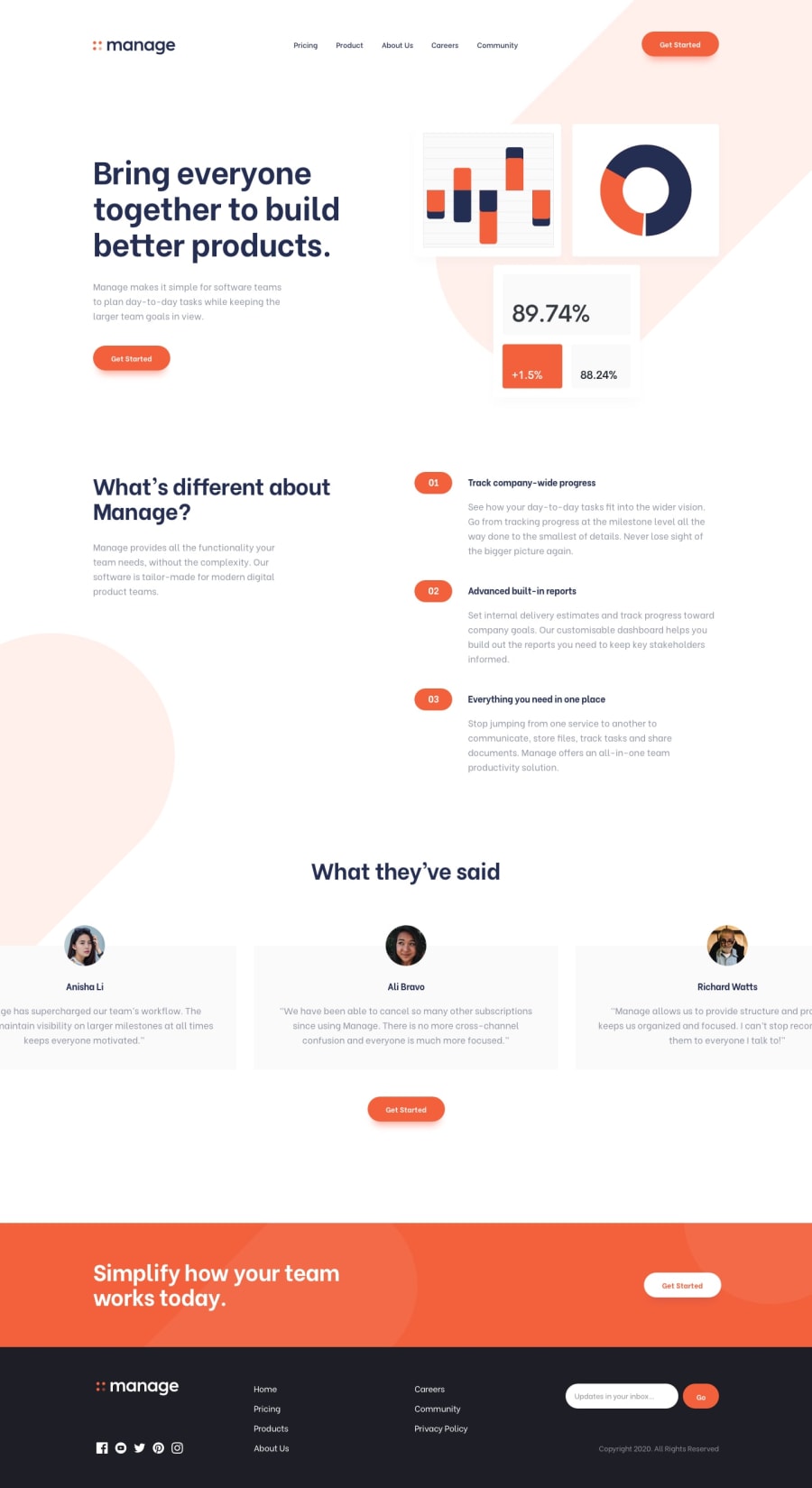
Awesome work Shady! Just a couple of things I've noticed -
- There isn't a validation set up for the newsletter sign up in the footer (JS regex is great for this)
- Active/hover states are missing for the social icons in the footer
- Can't seem to interact with the testimonial slider (e.g. auto-loop on desktop and swipe/auto-loop on mobile.)
- Also, background colors are missing for the testimonial slider cards (unless this is intentional/different design approach)
- Can see the footer is full width but the inner divs aren't stretching all the way across x-axis
- The logo and copyright banner in the footer overlaps between breakpoints 850px and 1023px
Hope this helps.
Aman.
0
Please log in to post a comment
Log in with GitHubJoin our Discord community
Join thousands of Frontend Mentor community members taking the challenges, sharing resources, helping each other, and chatting about all things front-end!
Join our Discord
