Responsive landing page (CSS flexbox, CSS grid, vanilla JS, Gulp)
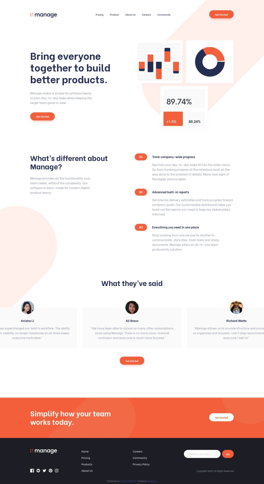
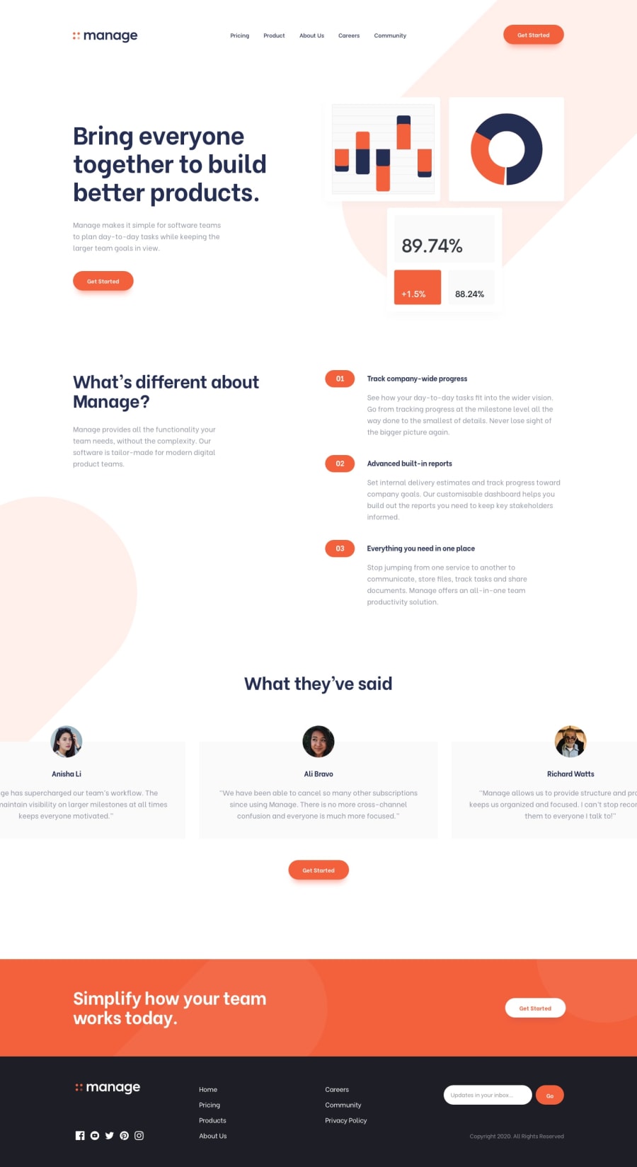
Design comparison
Solution retrospective
I tried hard on this challenge. It took me hours to configure Gulp for the first time. I also used CSS Grid for the first time (only in the footer, though) and made it work in IE 11. But the most challenging thing to me was to position background images.
Feedback is welcome and appreciated :)
Community feedback
- @whimsicurl-creationsPosted over 4 years ago
Excellent job, Ksenia! This looks practically pixel perfect in your screenshot (something I have yet to achieve!). It scales well across screen sizes and has nice hover effects. I have yet to tackle this challenge, but I am bookmarking your solution as a guide when I feel up to tackling it. I would recommend trying to correct the accessibility issues to make it completely polished.
1@kseniusPosted over 4 years ago@whimsicurl-creations Thank you for the feedback! I hope my solution will be helpful to you :)
1 - @adarshcodesPosted over 4 years ago
Hi! @Ksenia, It's just wow. This is nearly perfect. You did amazing work on this challenge. Everything works so well like responsiveness, layout, and image slider. Would you like to share the ideas on how to do this perfectly??? I would love to hear it. And just a small suggestion, solve the Accessibility issues.
1@kseniusPosted over 4 years ago@adarshcodes Hi! Thanks for your feedback :)
My ideas are quite simple:
- I used Photoshop for measuring and PerfectPixel extension in the browser (I use Chrome) to check how my code fits the design.
- As for responsiveness, I used Mobile First approach and quite standard set of breakpoints: for tablets, for smaller screens, and for bigger screens (you can look at my source code for the values). Although, I needed some extra breakpoints for the background images.
- Positioning the tablet pattern background images took me several attempts, eventually I used
::beforepositioned absolutely on the header and the second section (in my code it has class '.features'). Then I was playing around withtop,background-sizeandbackground-positionproperties until I got the satisfying result. Oh, and CSS calc() function was of much help. - For the testimonials carousel I used Glide.js plugin, which is written in vanilla JS.
I hope this is what you wanted to hear. I also hope that everything is understandable, I'm learning English and am not fluent.
And yeah, I'm definitely going to solve the accessibility issues.
5@whimsicurl-creationsPosted over 4 years agoThanks, @ksenius, for sharing your approach and helpful tools. I'm going to check out that PerfectPixel extension to help improve my solutions. I've also had some trouble positioning pseudo-elements with ::before, but I'm learning and getting a bit better.
P.S. Your English is just fine - keep up the fantastic work!
0@adarshcodesPosted over 4 years ago@ksenius Thanks for sharing your ideas. And everything is understandable to me(nice description). And yes, your English is fine.
0 - @alex-kim-devPosted over 4 years ago
Great work! The design, how the css is organized - it's just awesome!
I noticed i can't swipe the testimonials card again if the previous animation is not ended.
Looking forward to your next solutions.
0 - @mattstuddertPosted over 4 years ago
Awesome work on this challenge, Ksenia! You nailed the design again! 💯
Keep up the great work! 🙂
0
Please log in to post a comment
Log in with GitHubJoin our Discord community
Join thousands of Frontend Mentor community members taking the challenges, sharing resources, helping each other, and chatting about all things front-end!
Join our Discord
