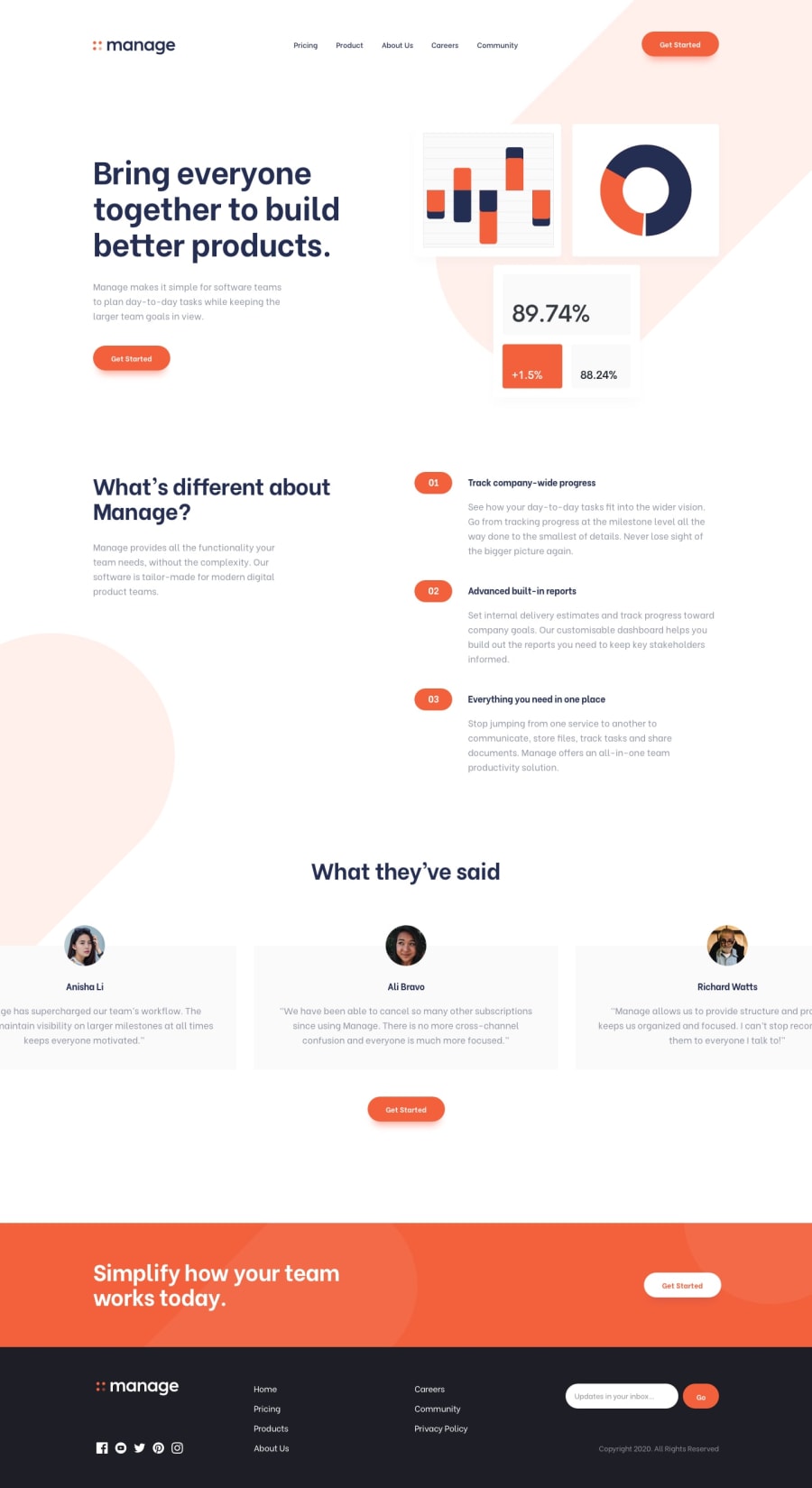
Design comparison
SolutionDesign
Solution retrospective
i had a hard time using the backgroud images provided for the project and also with getting the mobile nav menu to look how it was meant to
Community feedback
- @catherineisonlinePosted almost 2 years ago
Looks great! I see you have some validation for the footer email input but it's not a validation of the actual email, just any input, might want to fix that 😊
Marked as helpful0
Please log in to post a comment
Log in with GitHubJoin our Discord community
Join thousands of Frontend Mentor community members taking the challenges, sharing resources, helping each other, and chatting about all things front-end!
Join our Discord
