Design comparison
SolutionDesign
Solution retrospective
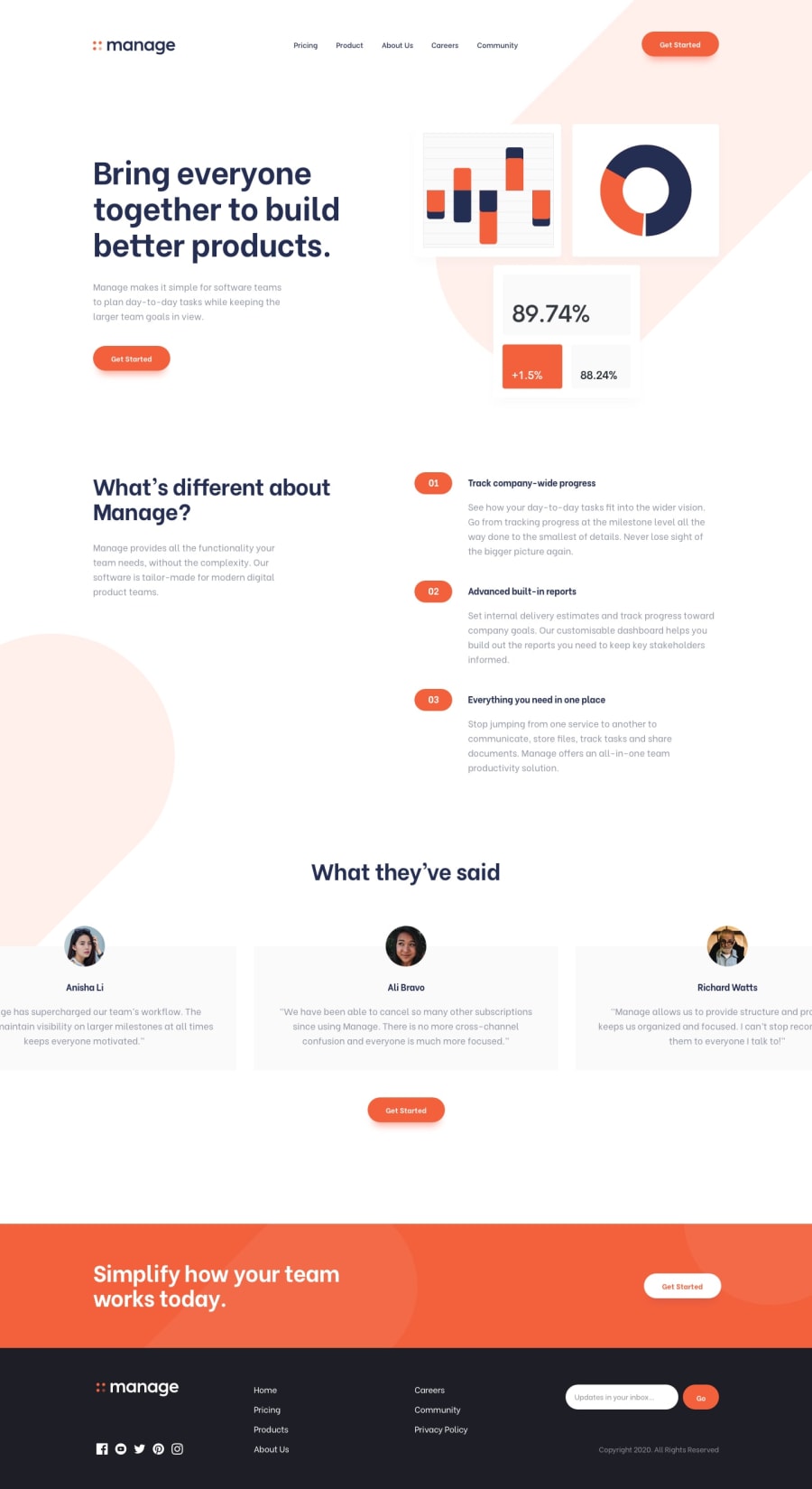
Hey Guys, I just finished the Manage Landing Challenge. I would like you all to see it and let me know how I can improve it. Let me know my mistakes. Thank you!.
I am having trouble making this website responsive with the pattern for the background. Any tips to solve this?
Community feedback
- @wendyhamelPosted almost 3 years ago
Hi, great job on this project! I see a few things you can improve:
- in the design the
patternin the header / hero section starts from the top of the page. With the white bachground on your nav, this doesn't look like that. - the header image gets squished when it doesn't fit the space. You can set the image to scale to fix this.
- the nav menu button is not in the viewport on small devices (below around 400px)
You should alse take a look at the accessibility issues. These are good best practices.
I hope I helped you out with this! Have fun coding!
0 - in the design the
Please log in to post a comment
Log in with GitHubJoin our Discord community
Join thousands of Frontend Mentor community members taking the challenges, sharing resources, helping each other, and chatting about all things front-end!
Join our Discord
